BRANDING
(34)
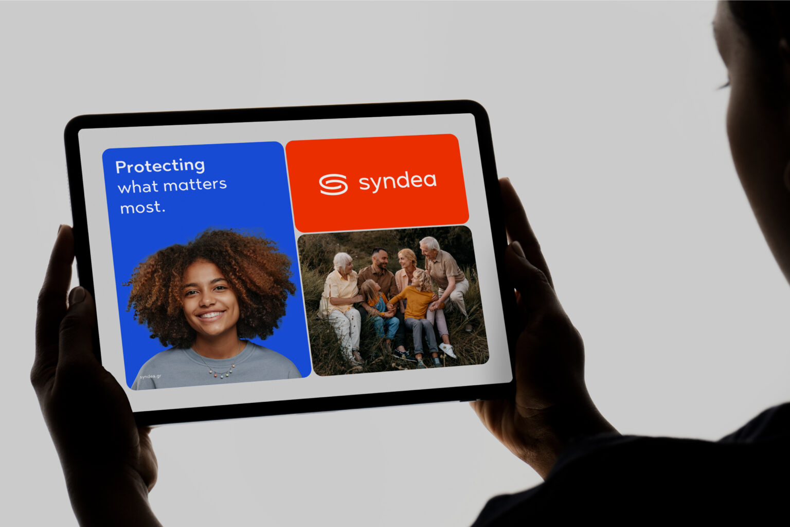
SYNDEA
BRANDING
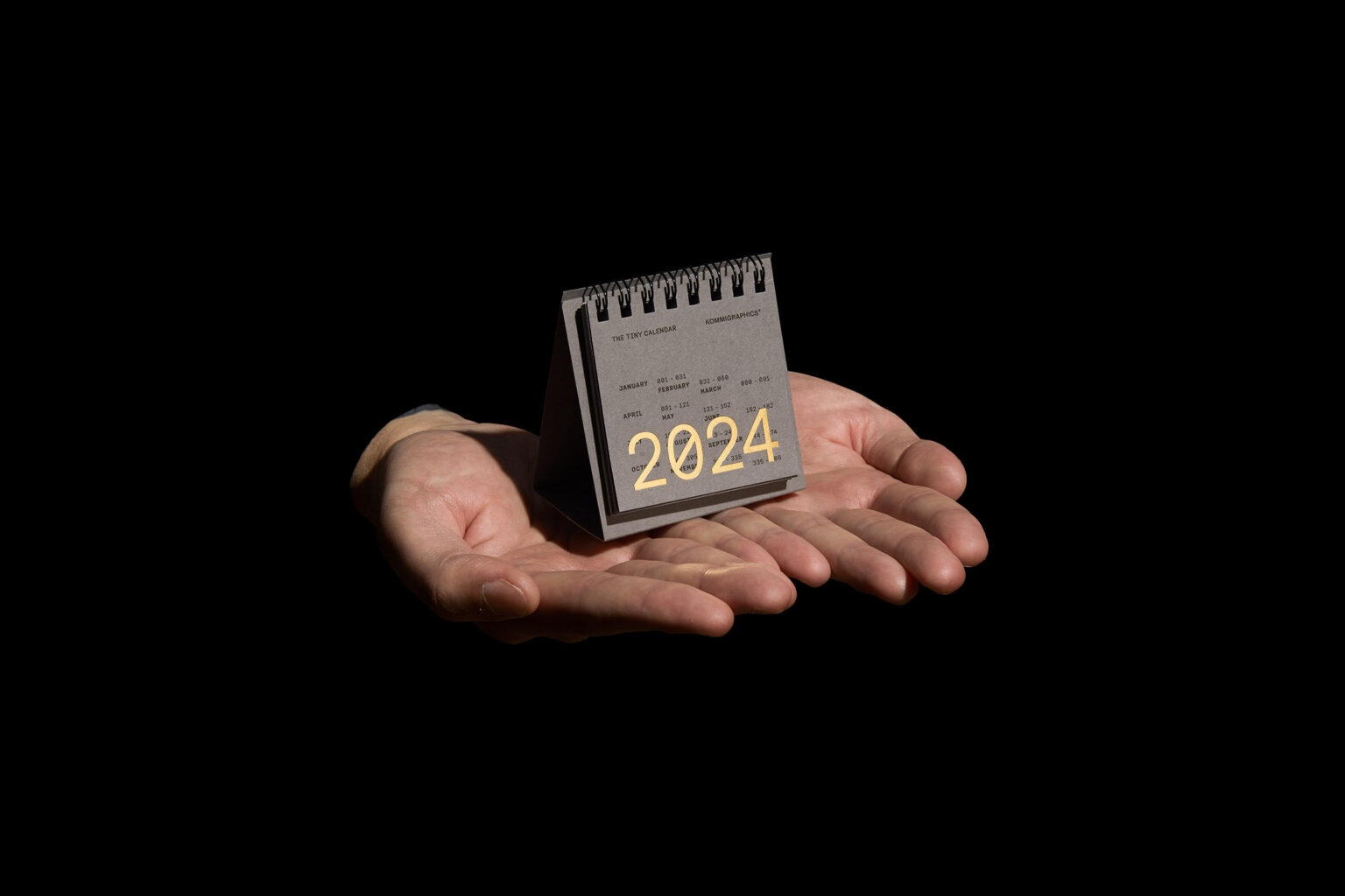
THE TINY CALENDAR
ALL PROJECTS

MINAS UNCHAINED BRANDING
BRANDING

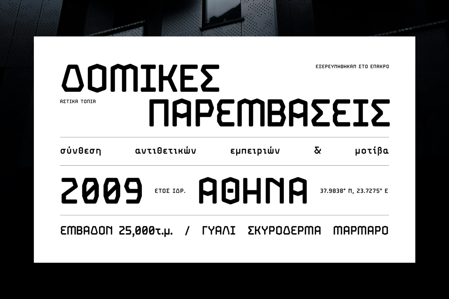
FARAWAY TYPEFACE
BRANDING
LOGOFOLIO
BRANDING
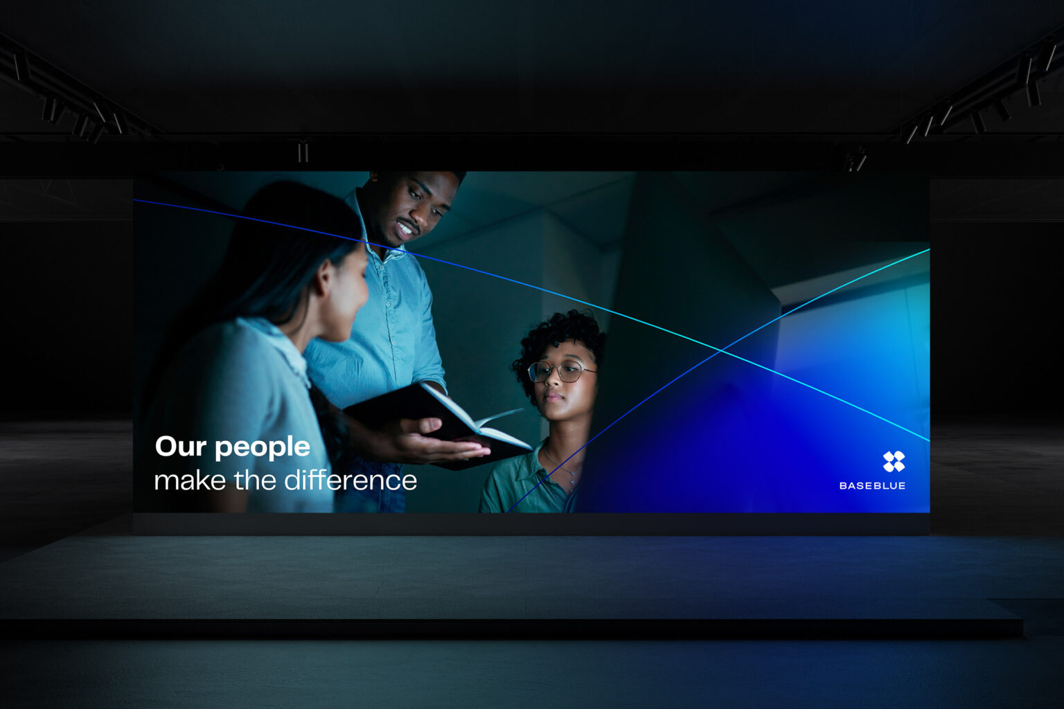
BASEBLUE
BRANDING
PAYZY BY COSMOTE
BRANDING
MAESTRO
BRANDING
EPISTROFI REWARD PROGRAM
BRANDING
EUROBANK
BRANDING
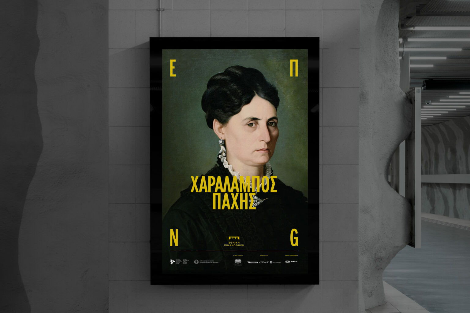
NATIONAL GALLERY
BRANDING
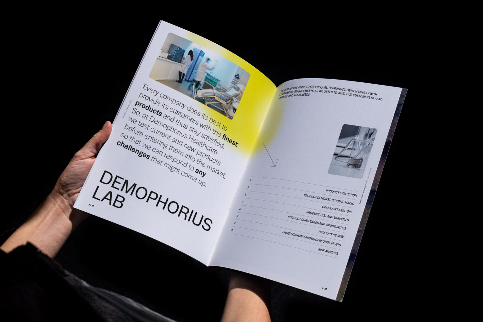
DEMOPHORIUS NEWSPAPER
BRANDING
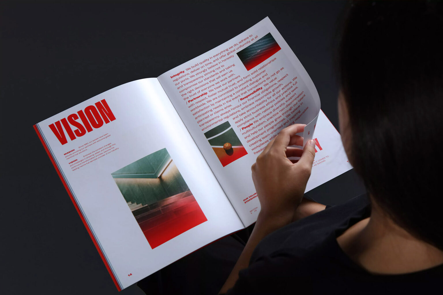
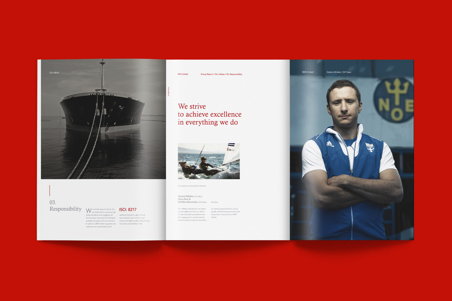
BMS ANNUAL REPORT 2021
BRANDING
EGG
BRANDING
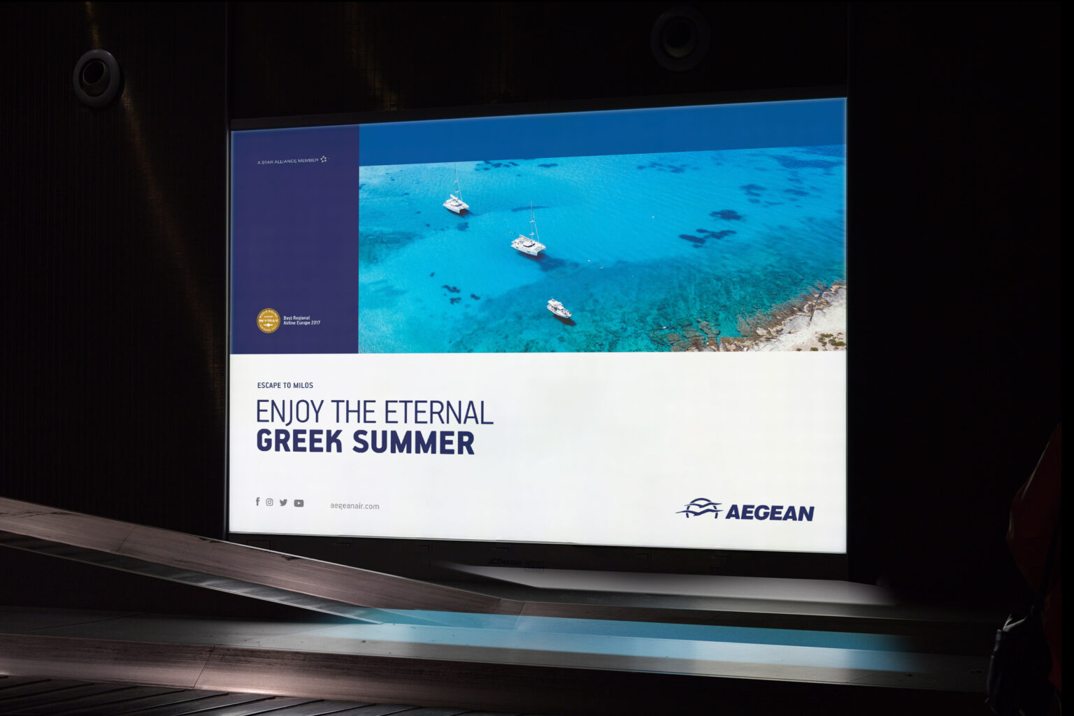
AEGEAN & OLYMPIC AIR
BRANDING
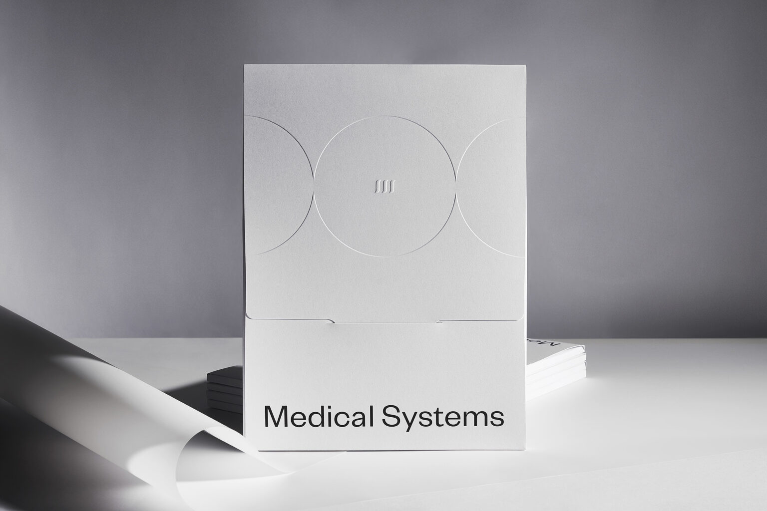
MEDICAL SYSTEMS
BRANDING
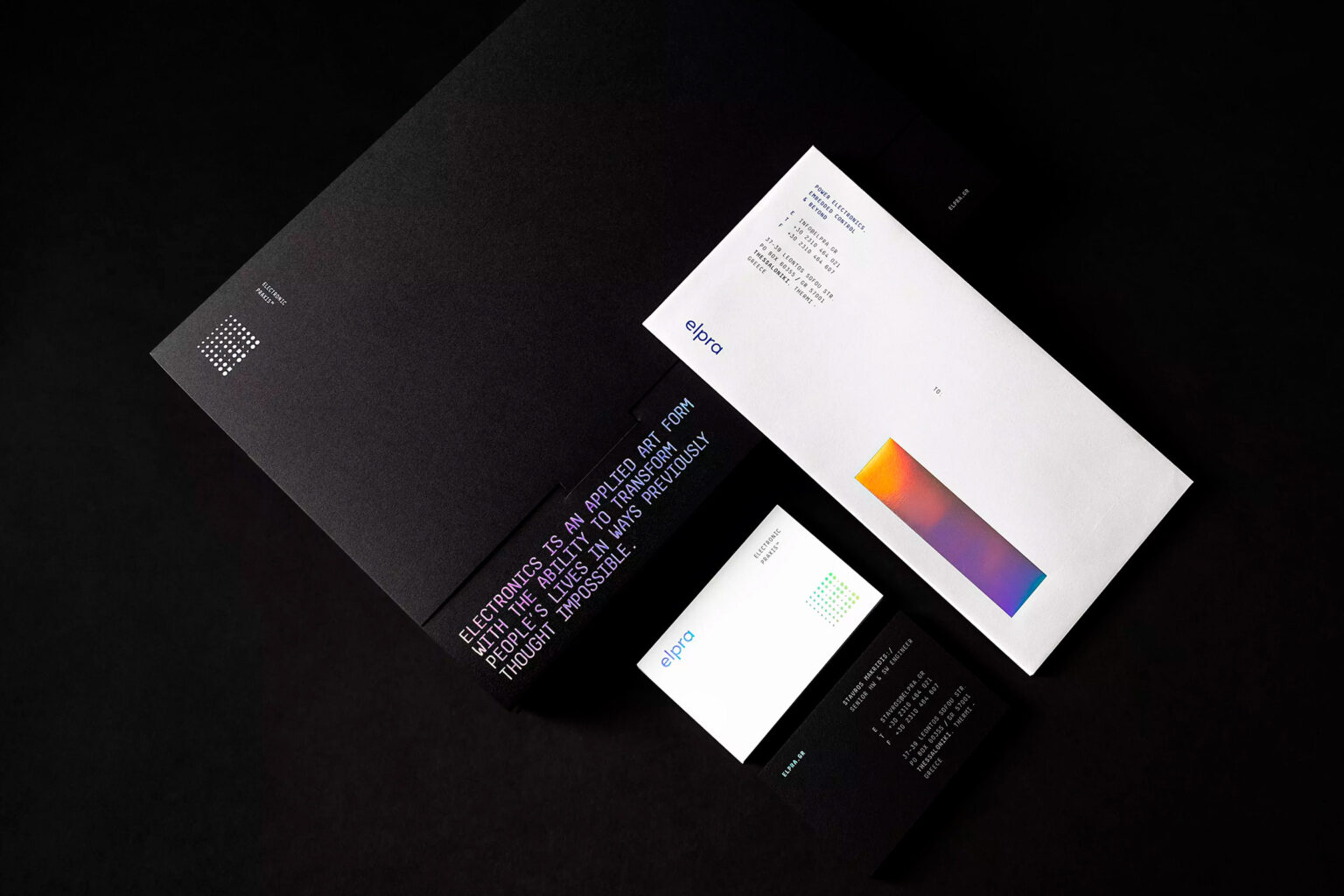
ELPRA
BRANDING
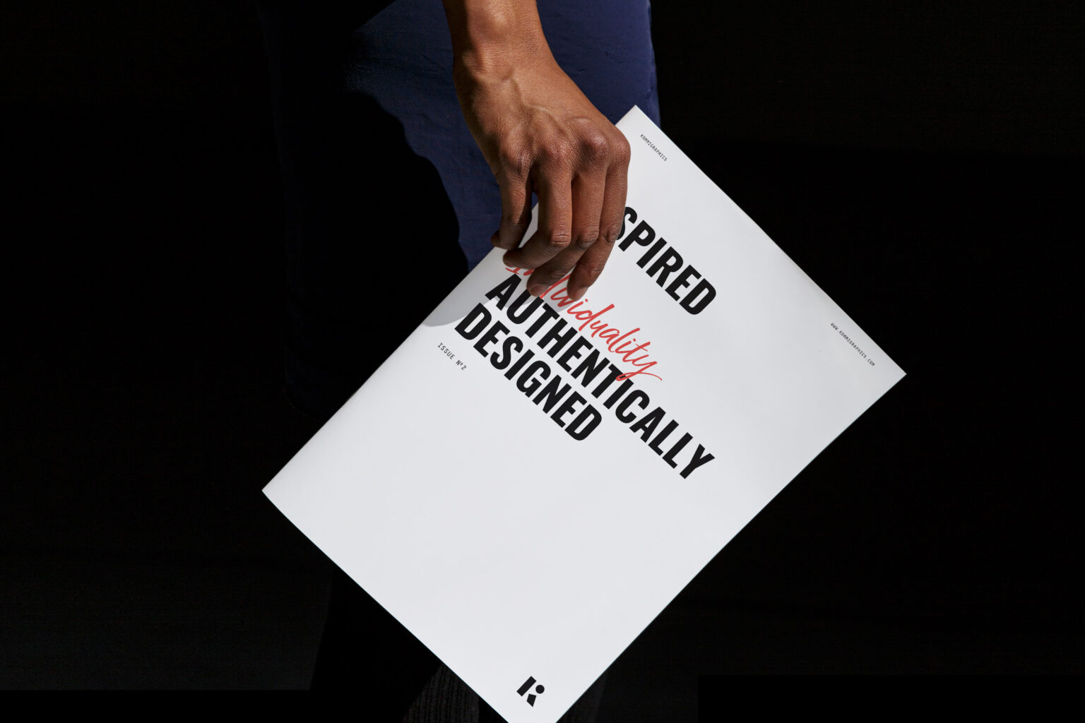
KOMMIGRAPHICS NEWSPAPER
BRANDING
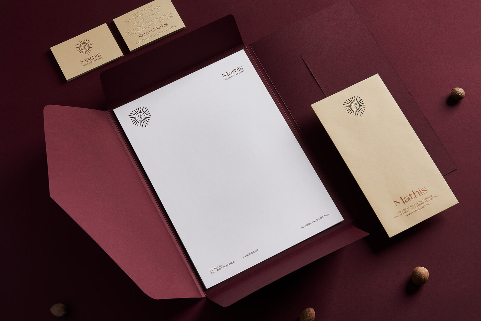
RETO MATHIS
BRANDING
DON TYPEFACE
BRANDING
YPERALFEIA
BRANDING
E.P. TYPEFACE
BRANDING
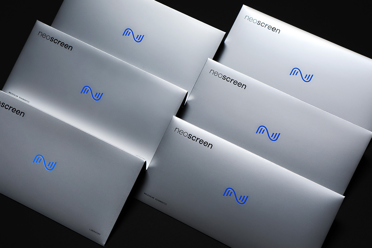
NEOSCREEN
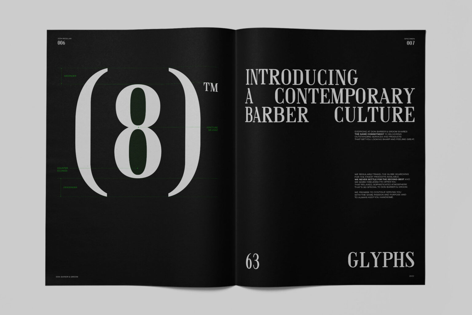
BRANDING
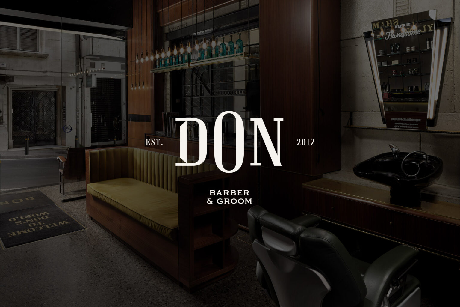
DON BARBER & GROOM
BRANDING

ASSET OFFICE INTERIORS CATALOGUE
BRANDING
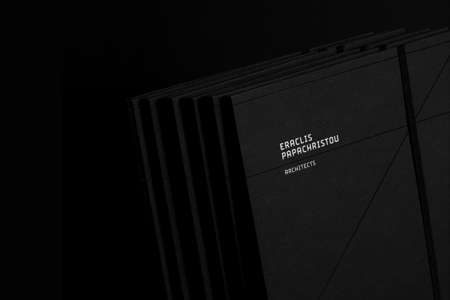
ERACLIS PAPACHRISTOU
BRANDING
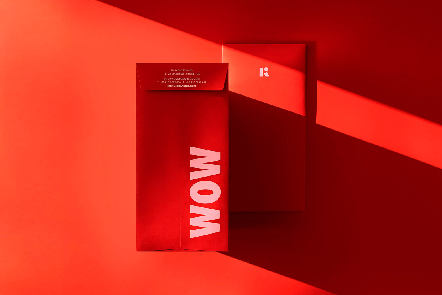
KOMMIGRAPHICS
BRANDING
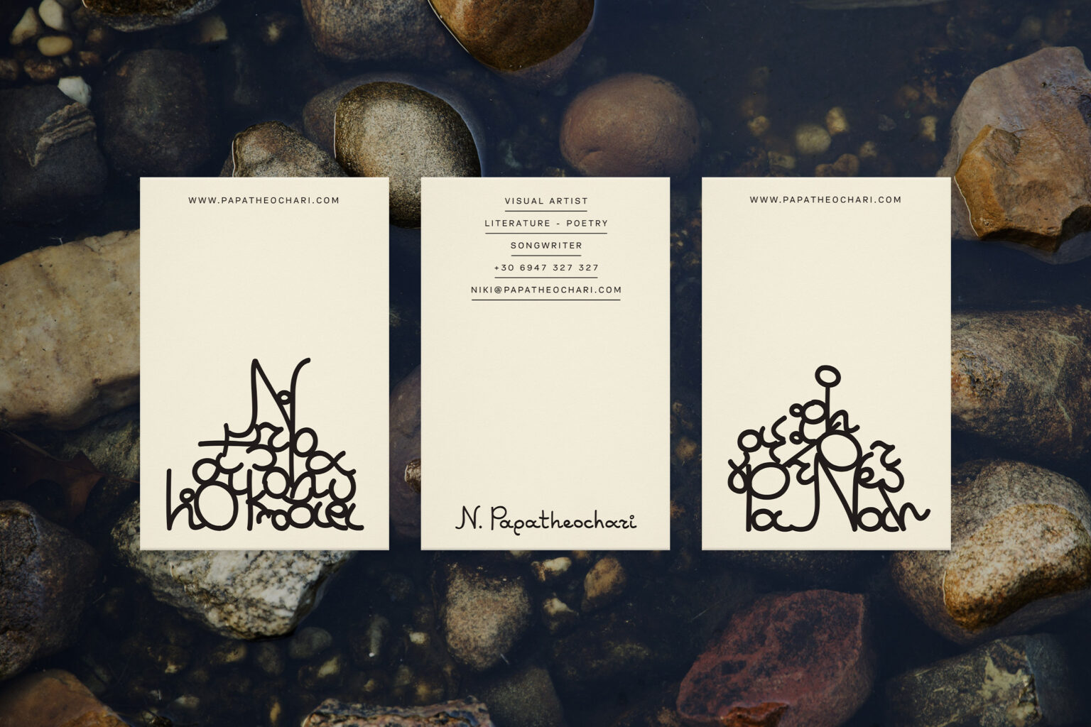
NIKI PAPATHEOCHARI PORTFOLIO
BRANDING
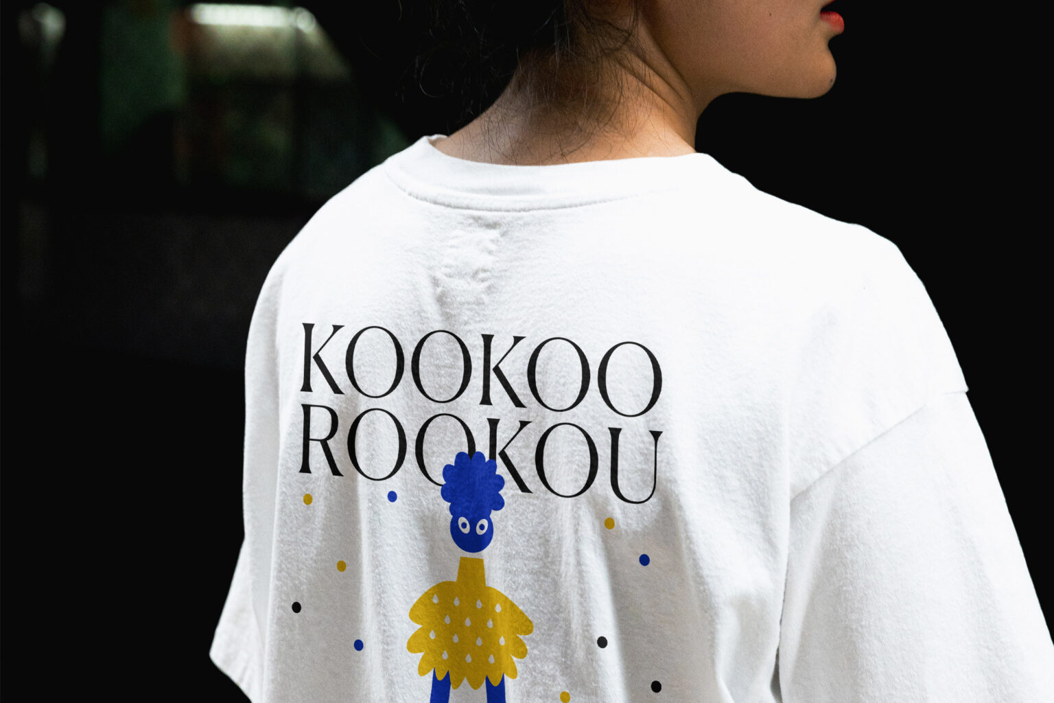
KOOKOOROOKOU
BRANDING
KBA LAW FIRM
BRANDING
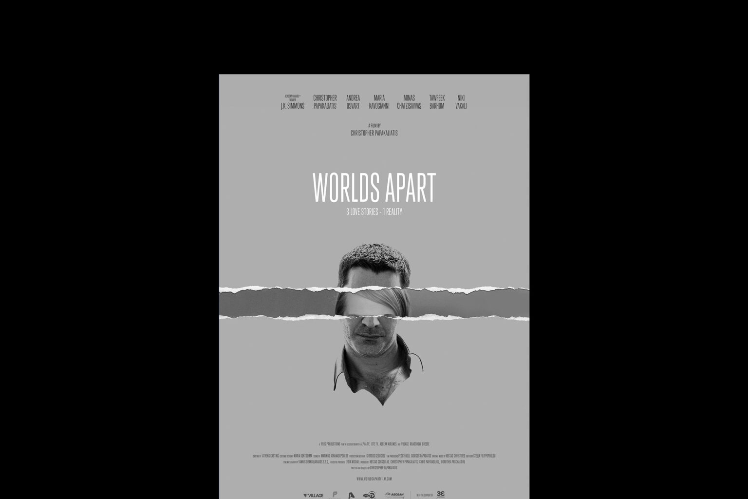
WORLDS APART
BRANDING
BMS UNITED ANNUAL REPORT
BRANDING
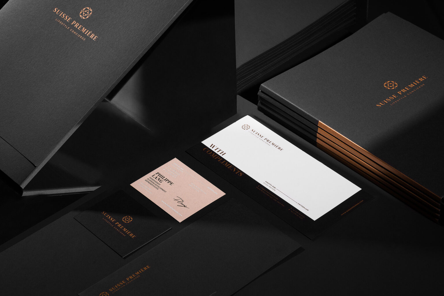
SUISSE PREMIERE
BRANDING
-
Services
BRANDING
Any brand’s messages are communicated through design, as the design is the ambassador of a brand’s identity.
-
Services
WEBSITE DESIGN
Visual communication and web design by kommigraphics. Brands across different markets and around the globe.
-
Services
PACKAGING DESIGN
Storytelling packaging design, based on a concept, on a story & so the story goes!
-
Services
MOTION DESIGN
Storytelling and brand empowerment through motion design!