-
SERVICES:
- Typeface design
- Concept
- Lettering
-
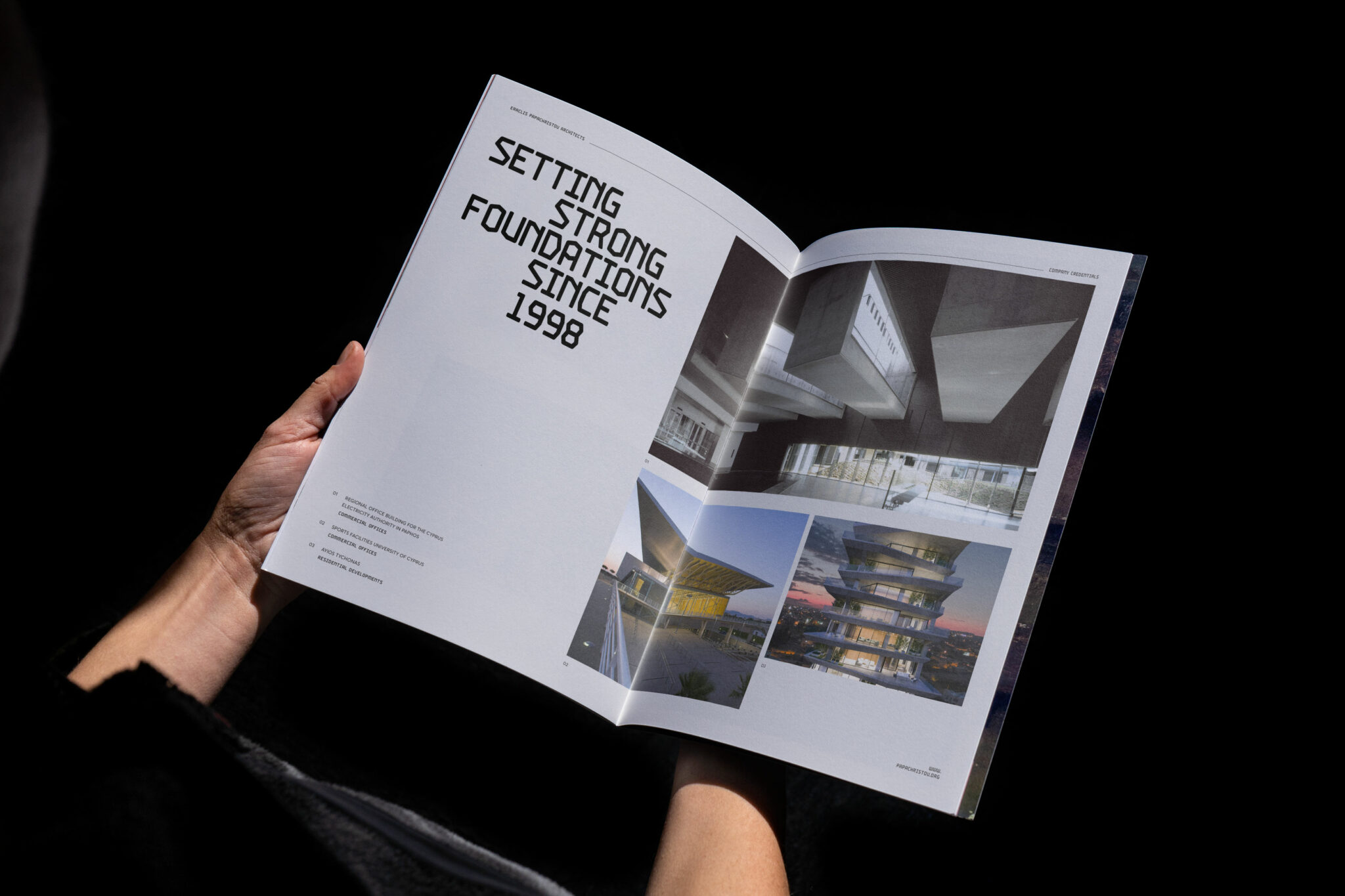
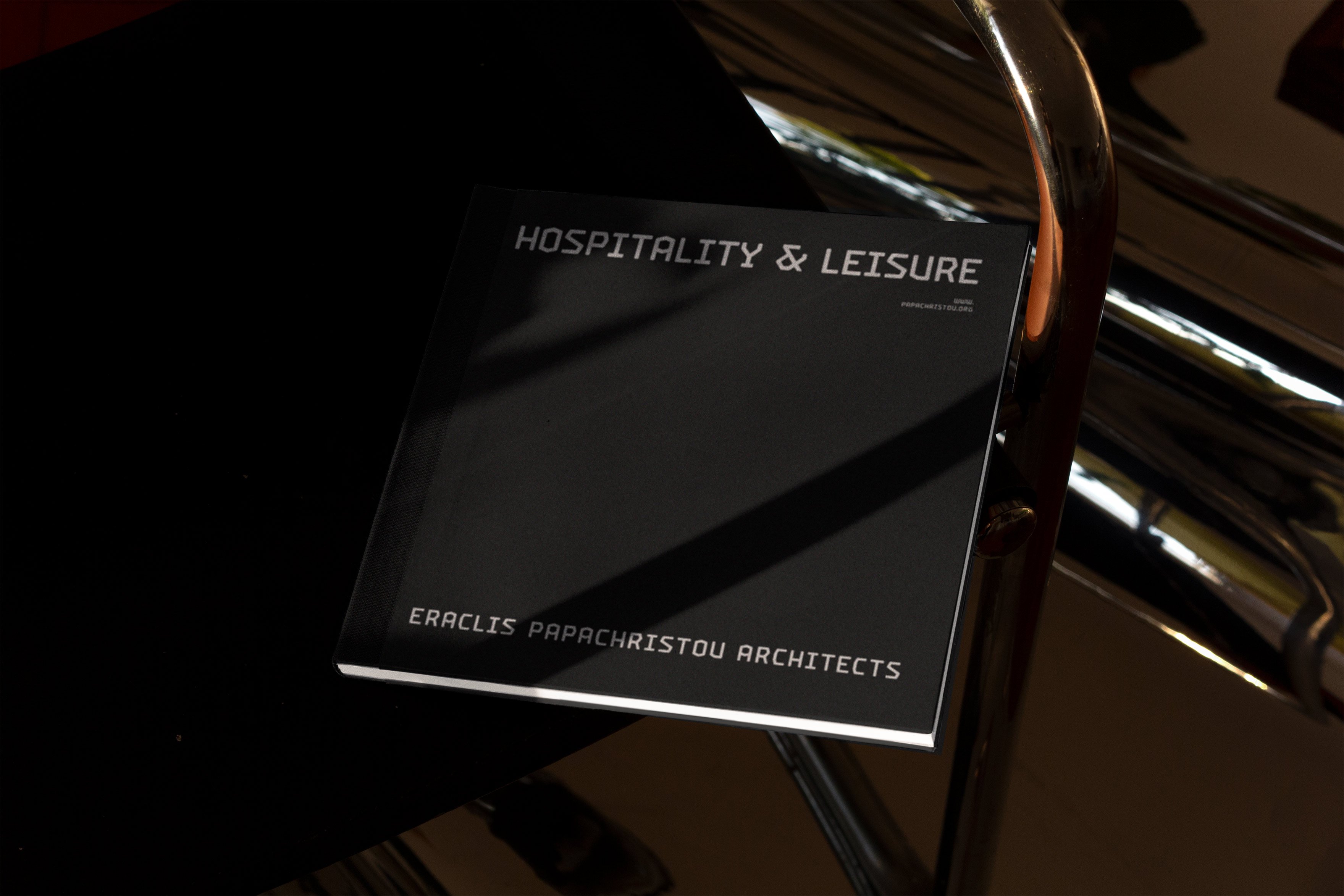
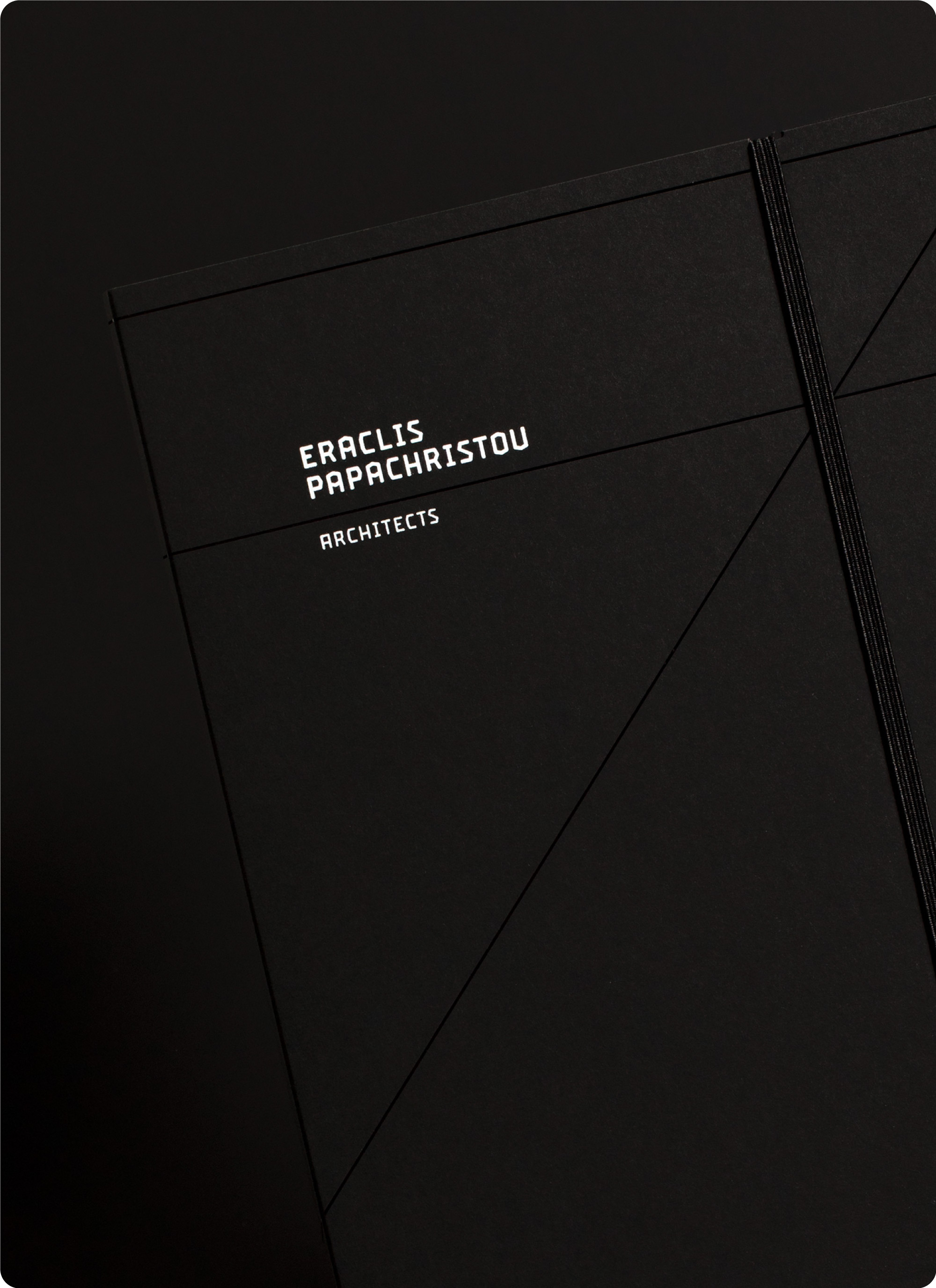
With more than 20 years of continuous presence in the architecture market, “Eraclis Papachristou architects” entrusted Kommigraphics for the design of their new brand identity as well as their entire corporate image
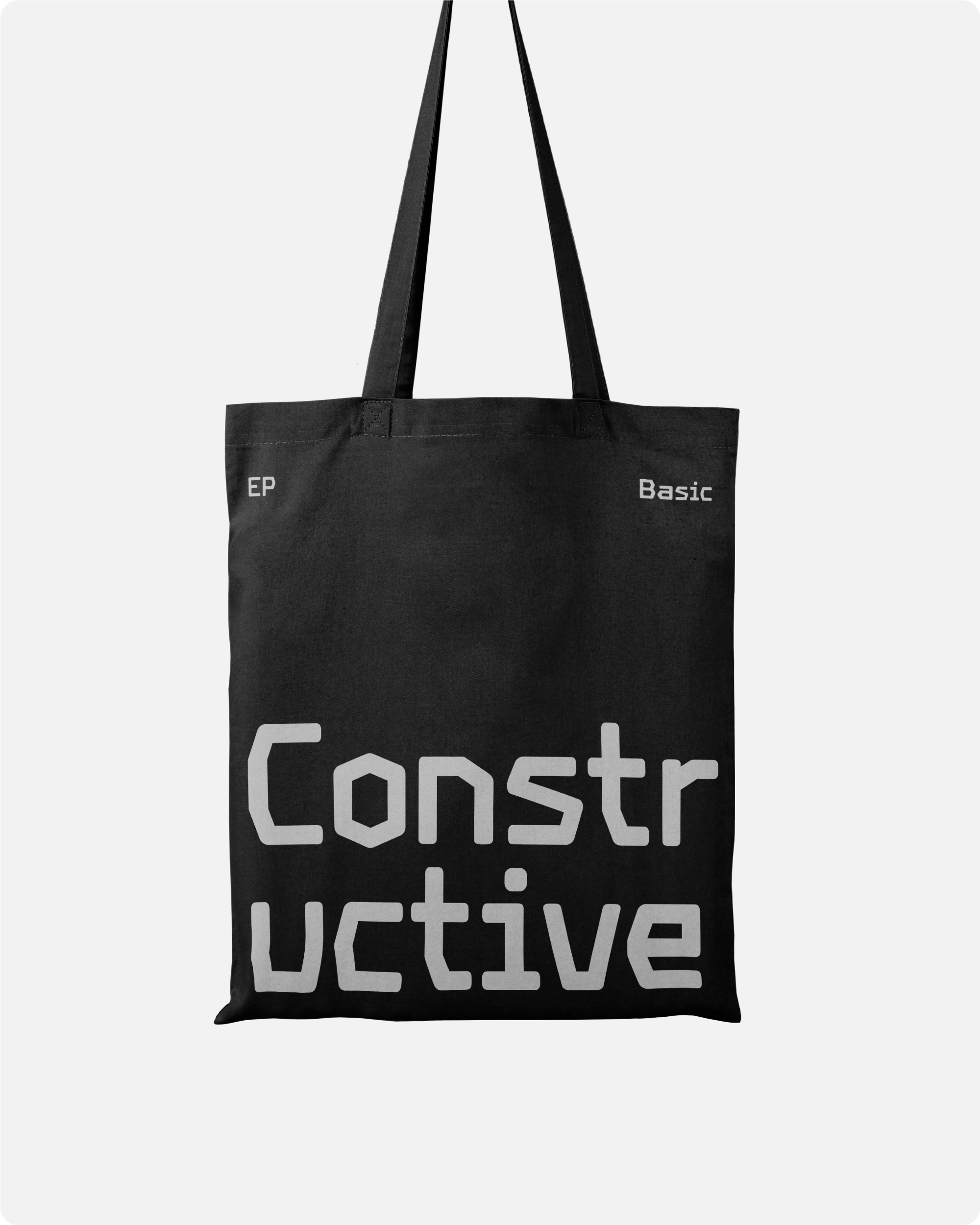
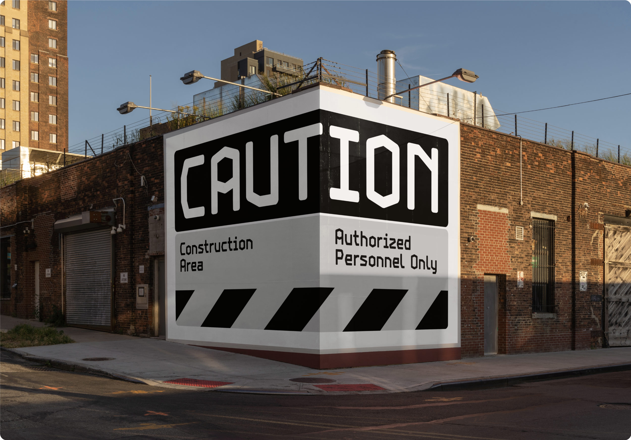
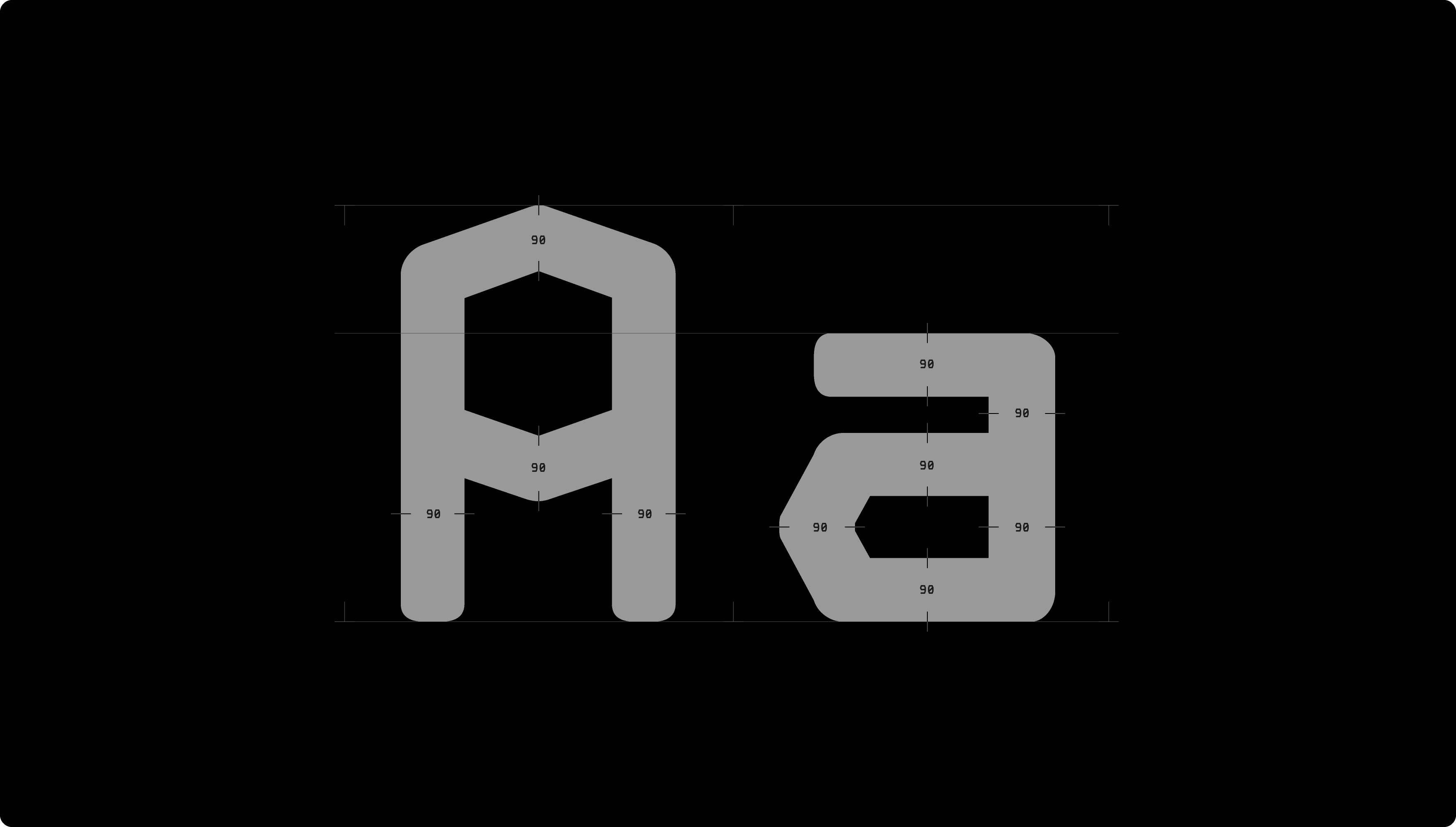
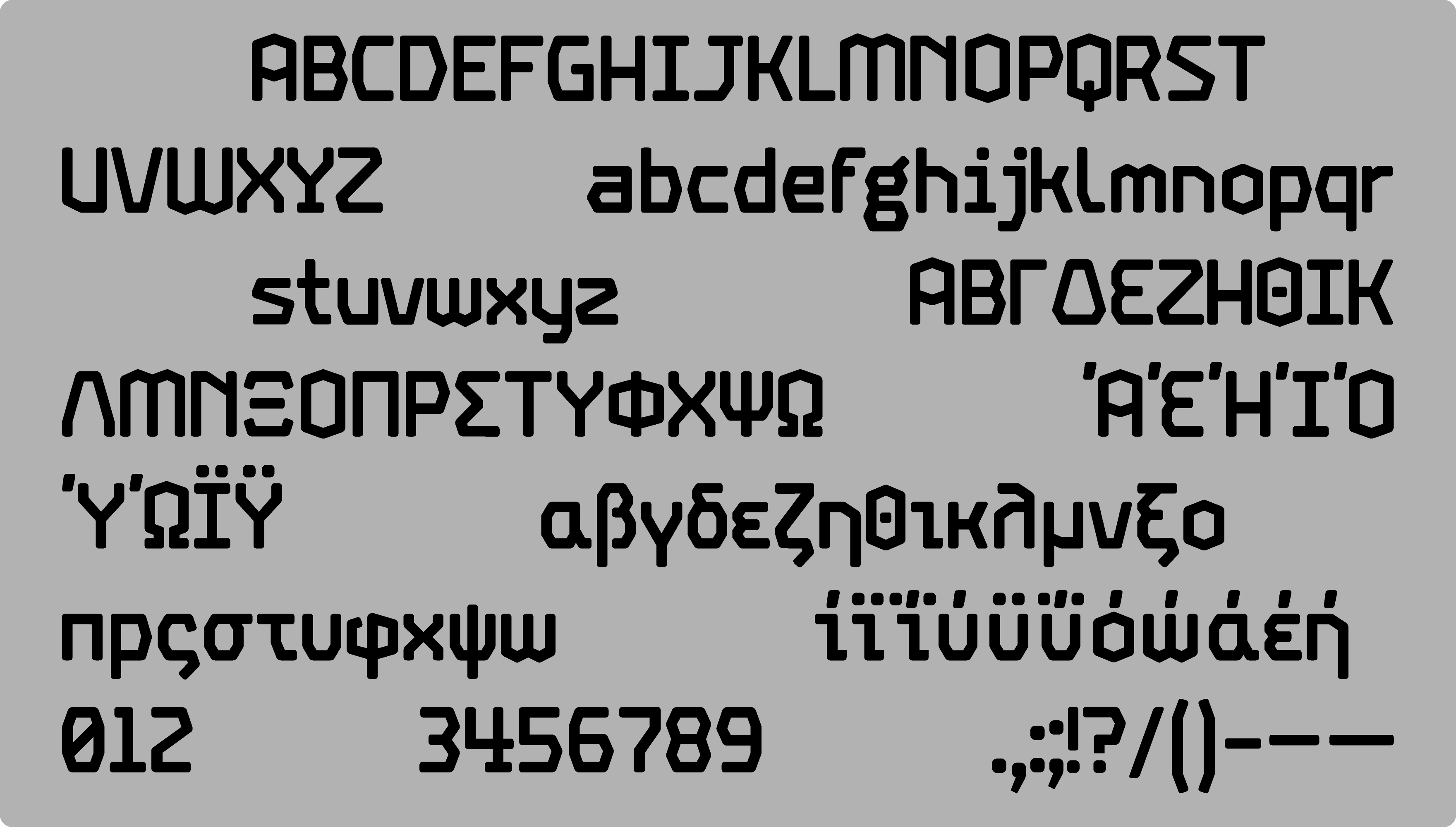
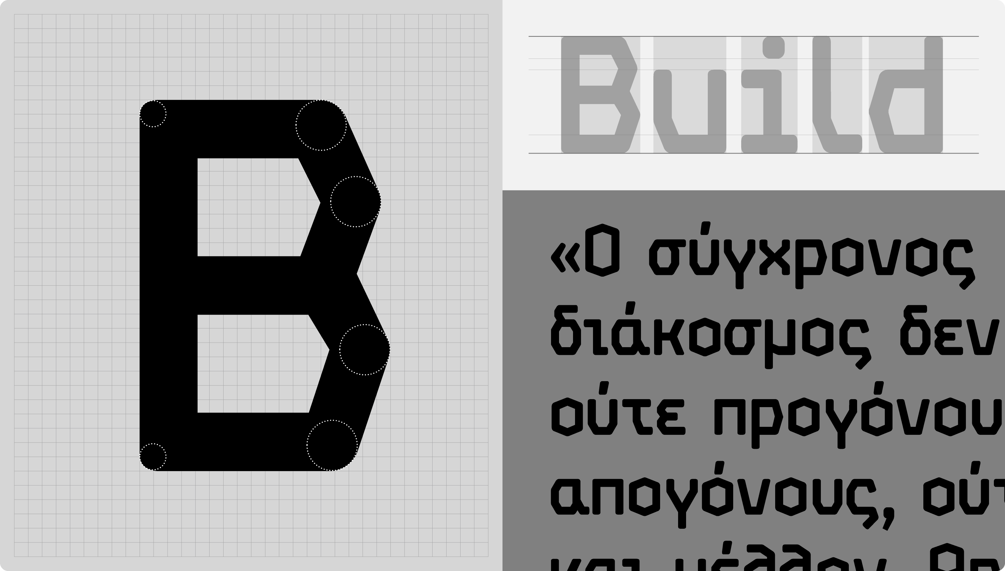
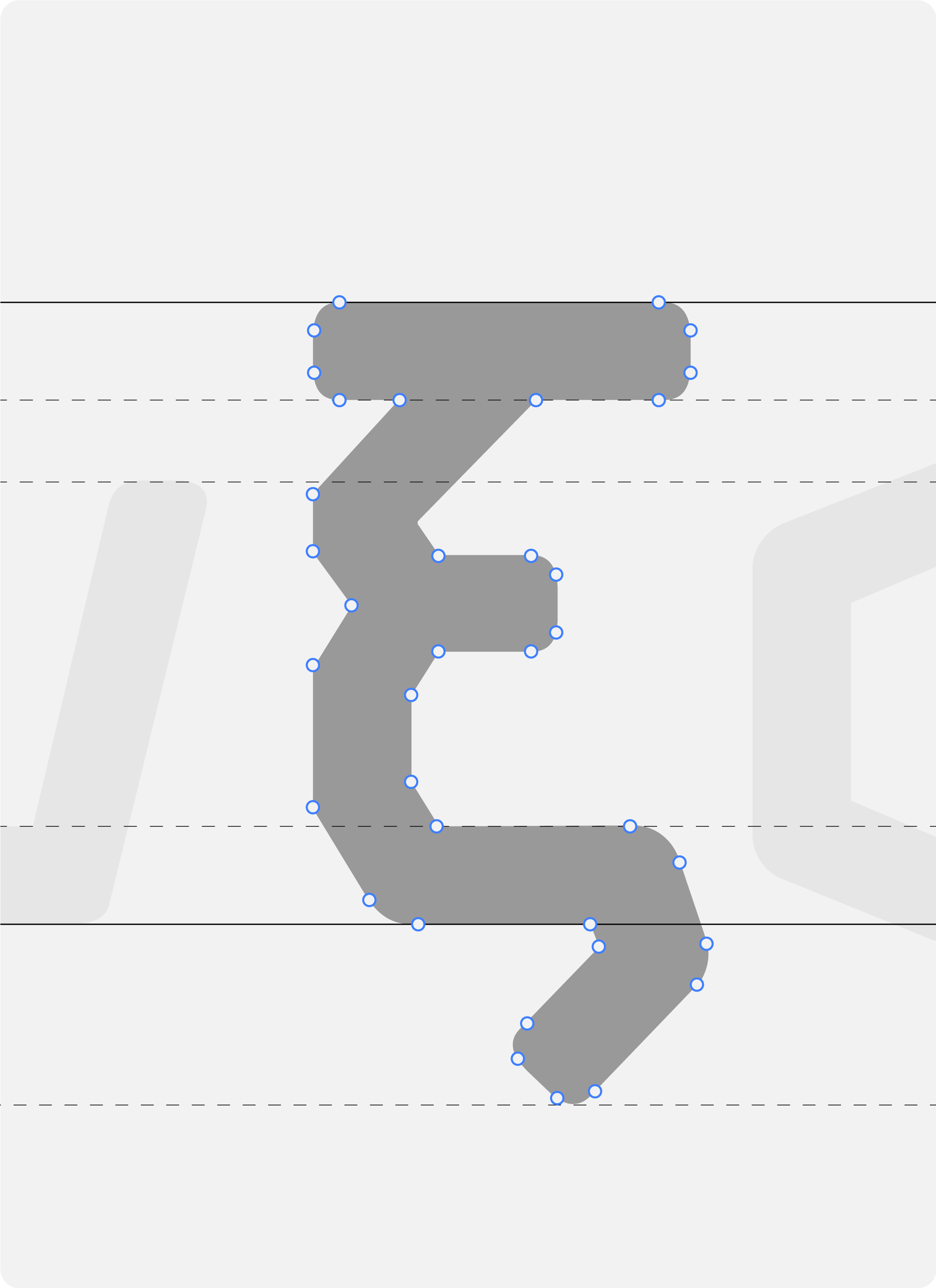
The design of a monospaced typeface originally applied to the company’s logo design was considered the ideal choice for a market where geometry and sharp lines dominate.
The references to the industrial and construction area, formed the basis of the company’s renewed logo, bonding its image with its specific specialization to the mind of its audience.
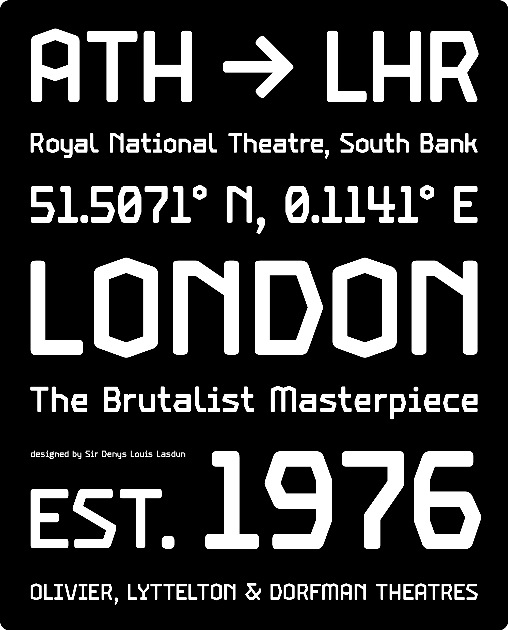
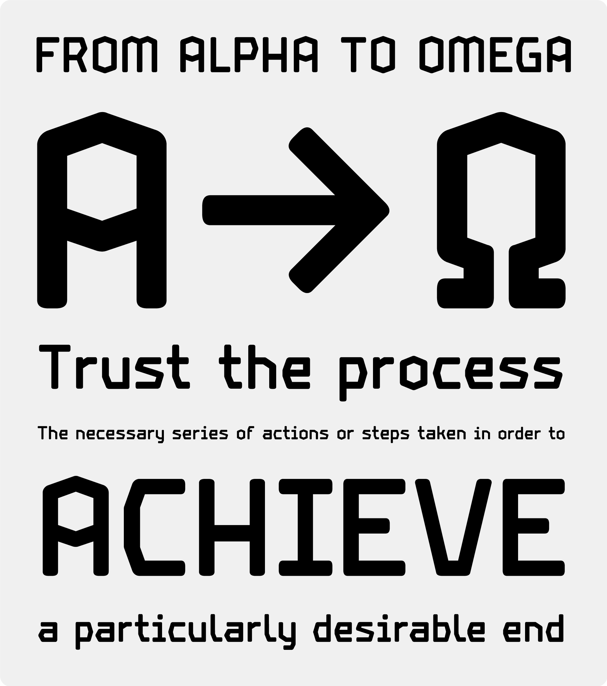
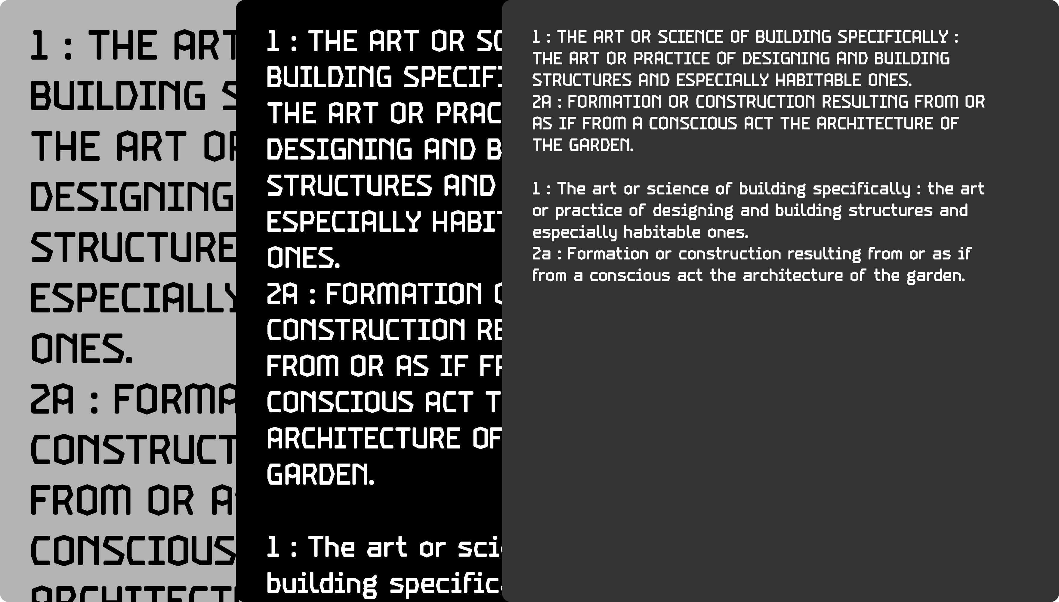
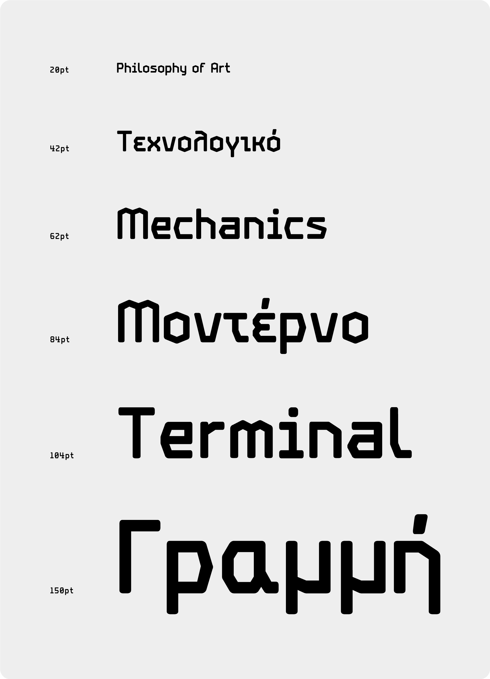
The identity’s geometric lines create a sharp and technocratic mood, with references to all three dimensions architects are using: length, width and depth, metrics essential to the architectural design. As part of the whole brand image, we also designed the company’s custom font.
The design of the custom font is the result of an integrated design that enhances the company’s visual communication on all media and activities.

A CUSTOM FONT THAT ENHANCES THE ENTIRE VISUAL COMMUNICATION OF THE BUSINESS - THROUGHOUT ITS MEDIA AND ACTIVITIES.
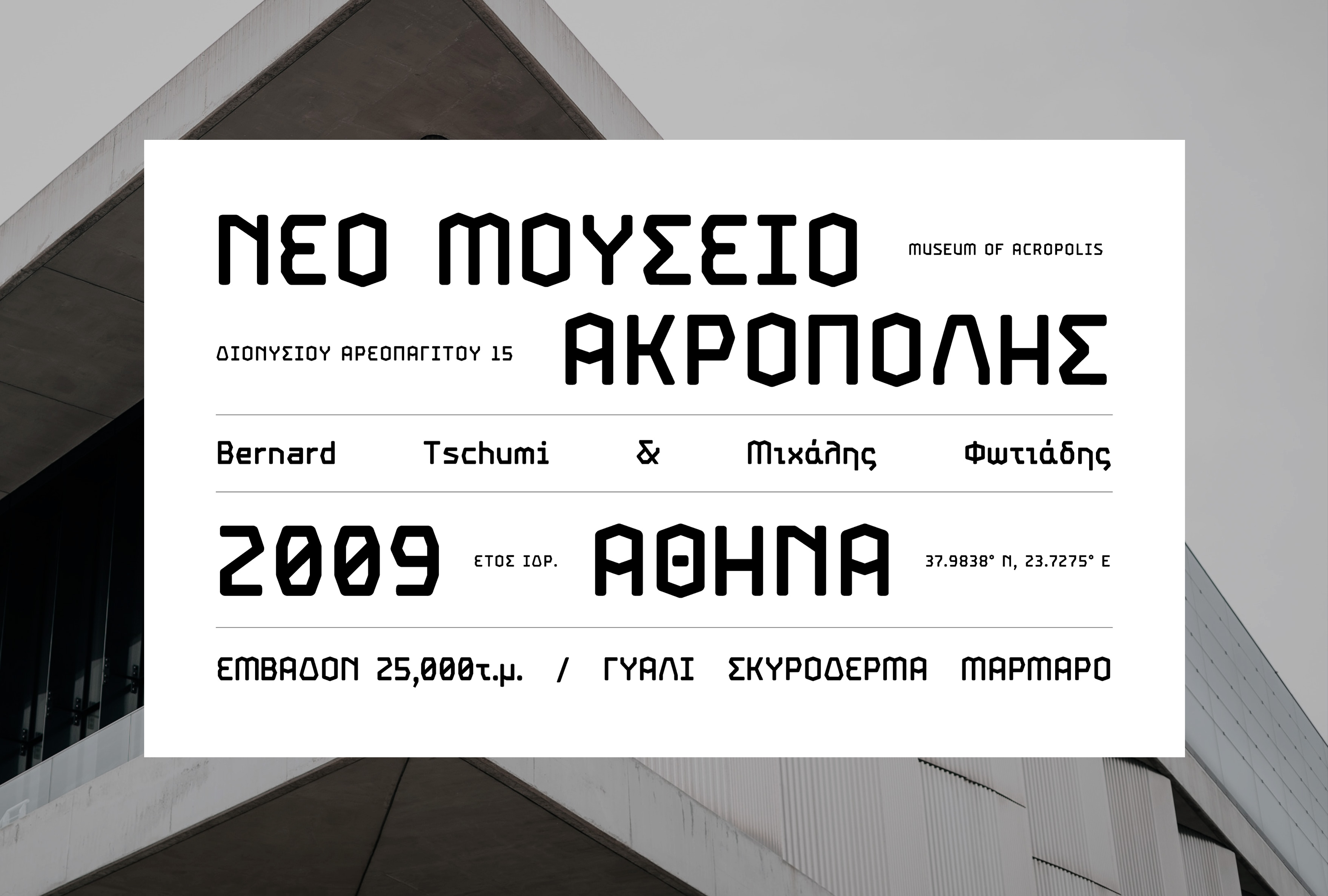
GEOMETRIC LINES THAT CREATE A SHARP AND AT THE SAME TIME TECHNOCRATIC MOOD.