-
SERVICES:
- Logo design
- Brand identity design
- Copywriting
-

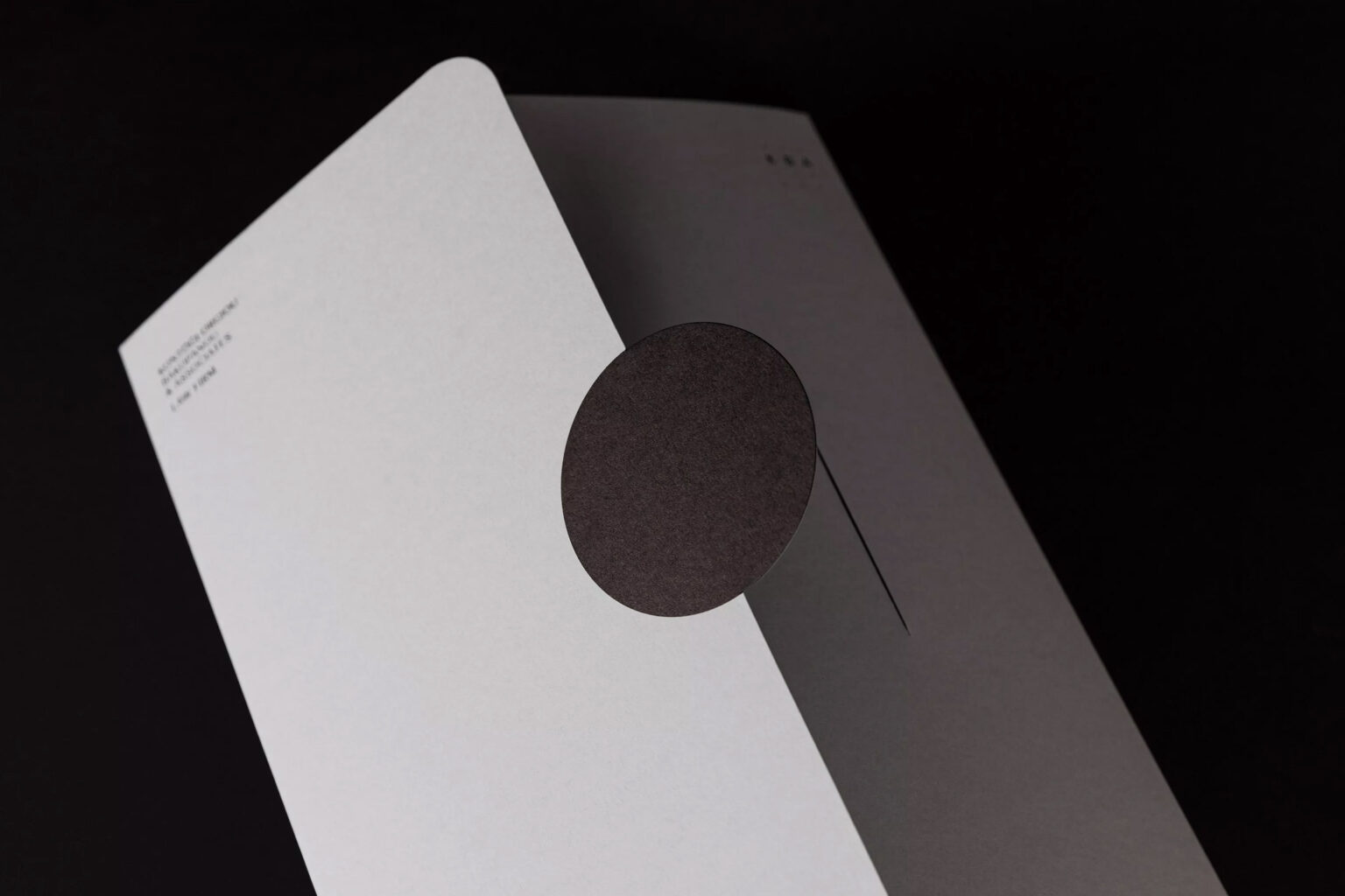
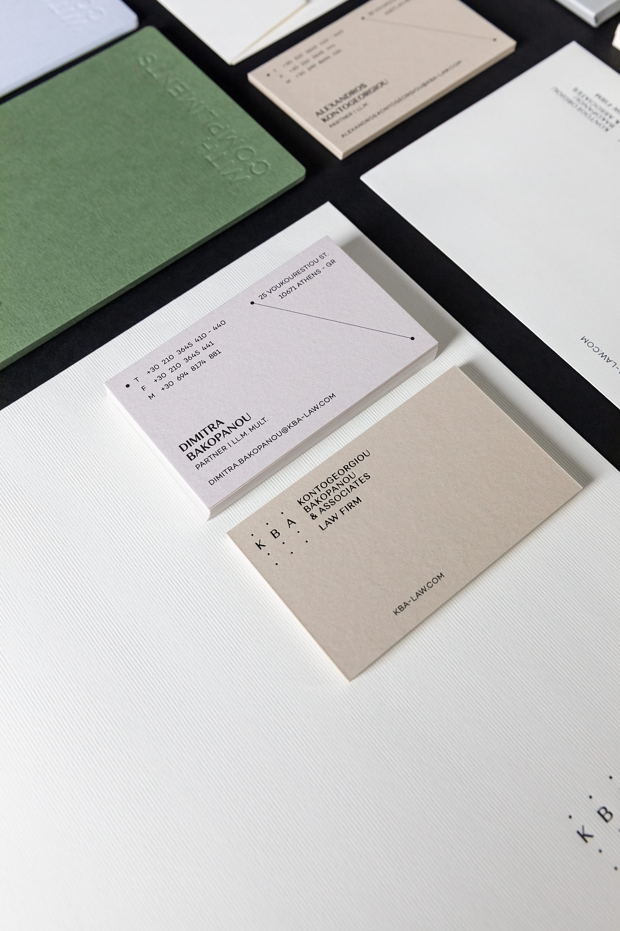
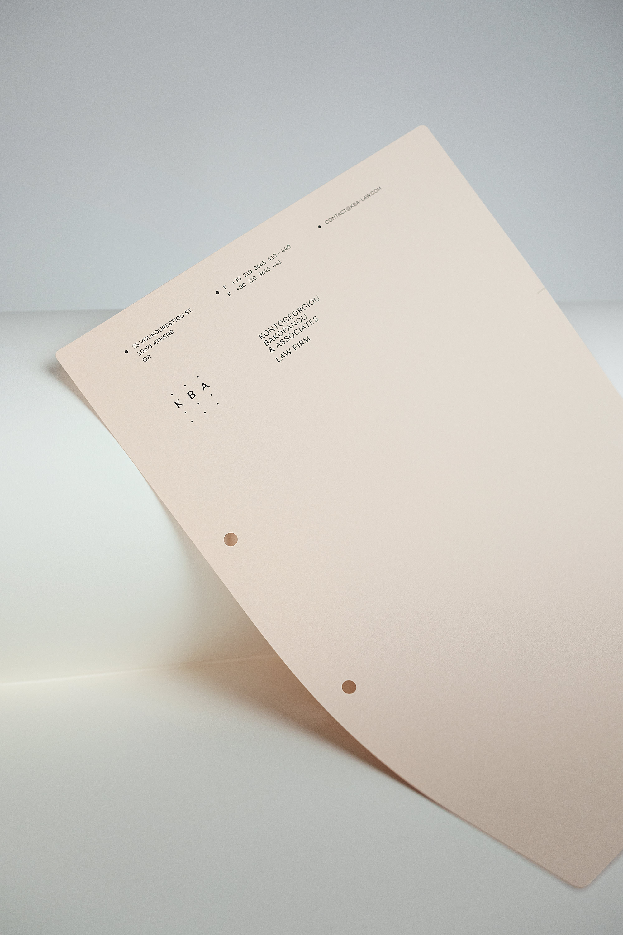
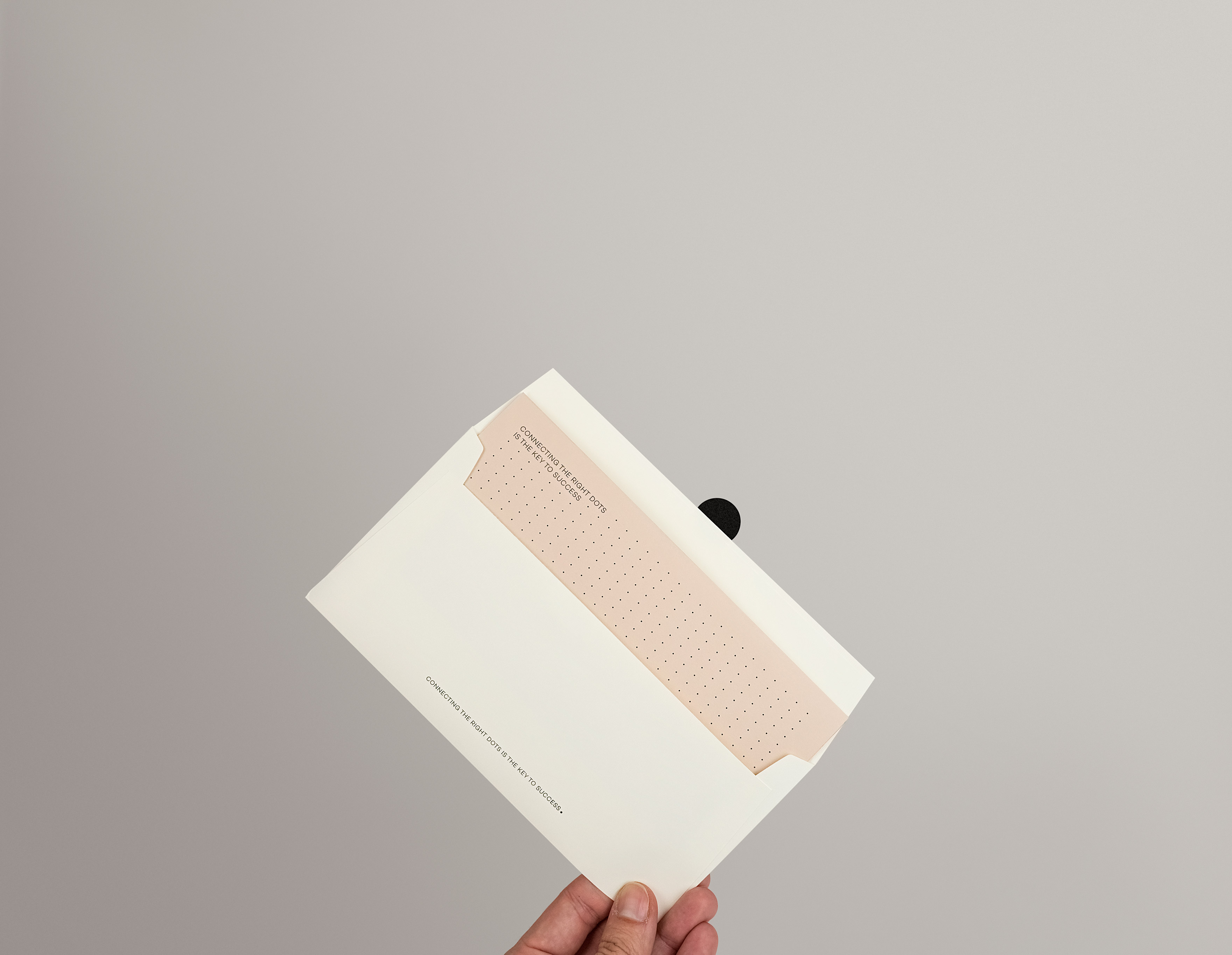
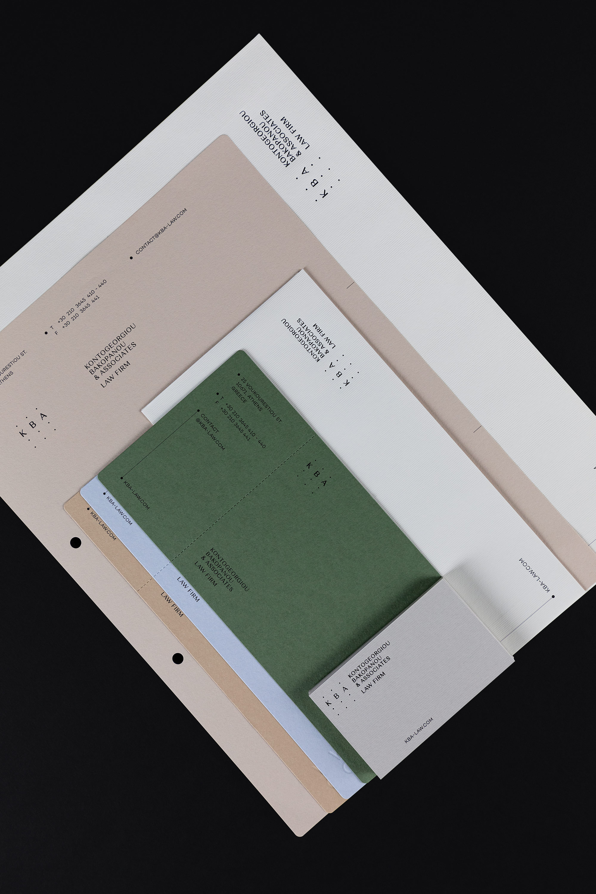
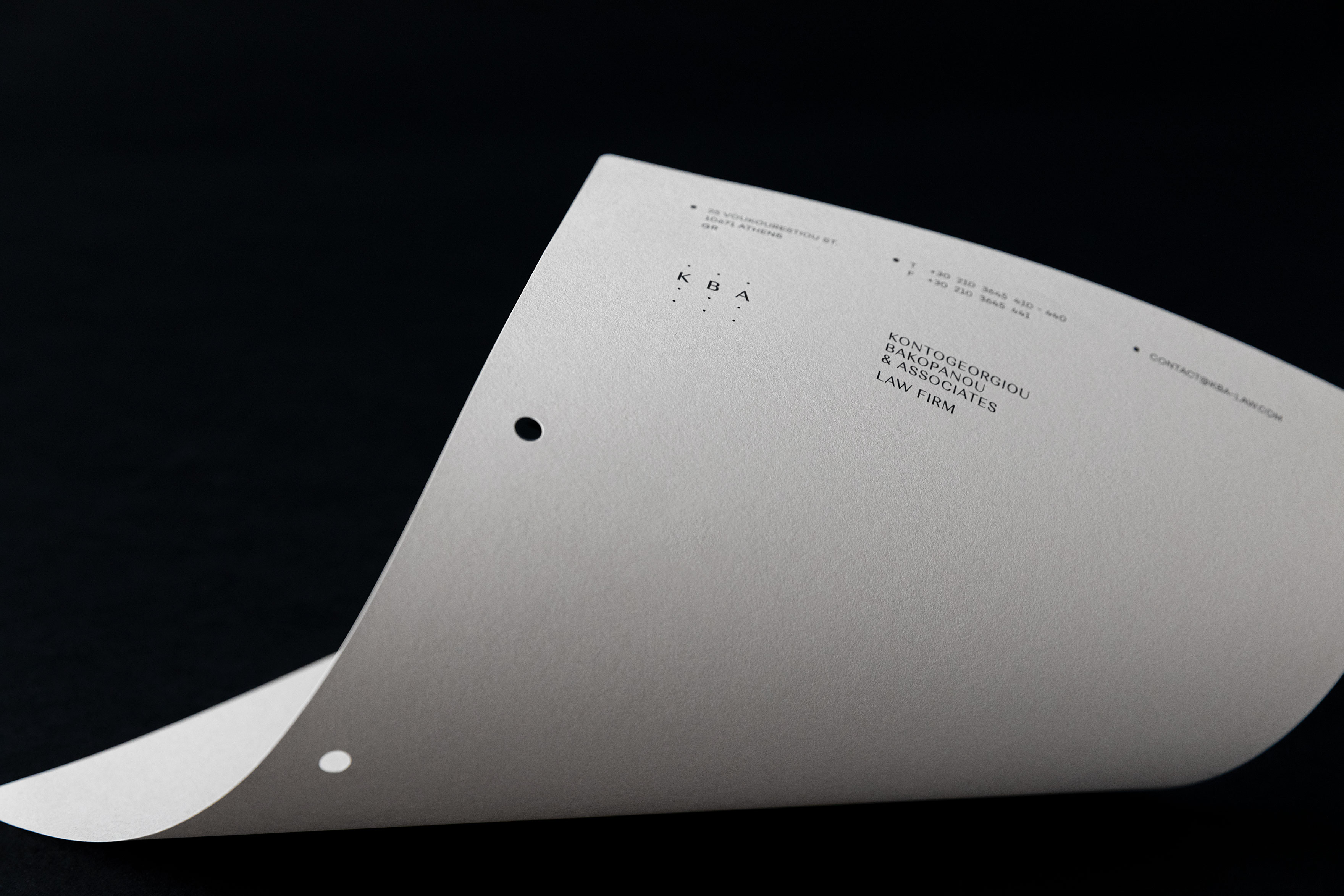
Logo & brand identity design for “KBA LAW FIRM”, to introduce the company’s quality services and work through its modern visual identity.
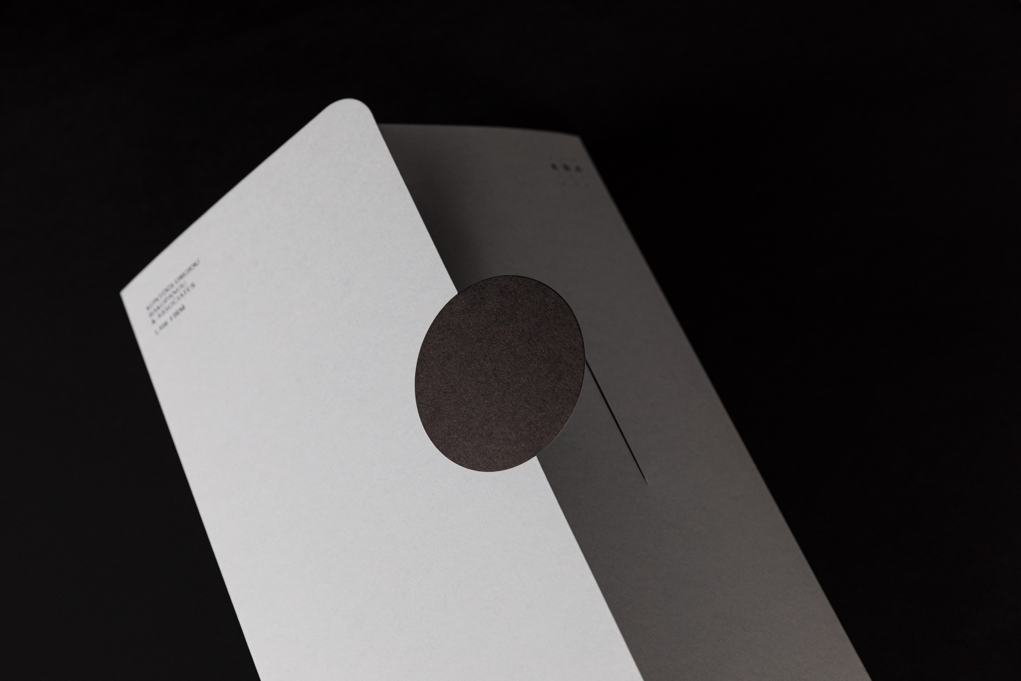
The inspiration of the logo design came from the process followed, when these lawyers take on a case that needs to be resolved. That is, by collecting and connecting different elements of a case, a process that at the logo design stage is visualised by connecting the dots. The use of two connected dots refers to strategic thinking while artfully allows the creation of a minimal design. The initials of the logo become part of the puzzle created by the use of dots, which are spread throughout the identity’s applications. The combination of dots and connecting sharp lines as shown on the brand identity design create a grid that refers to mind mapping.
The minimal design creates a harmonious contrast and in combination with the use of premium papers, textures and pastel colours, refer to vintage case files with a fresh execution. Finally, all applications use special printing techniques such as die cuts and rotogravure, thus creating specific interest and depth to the range of applications.
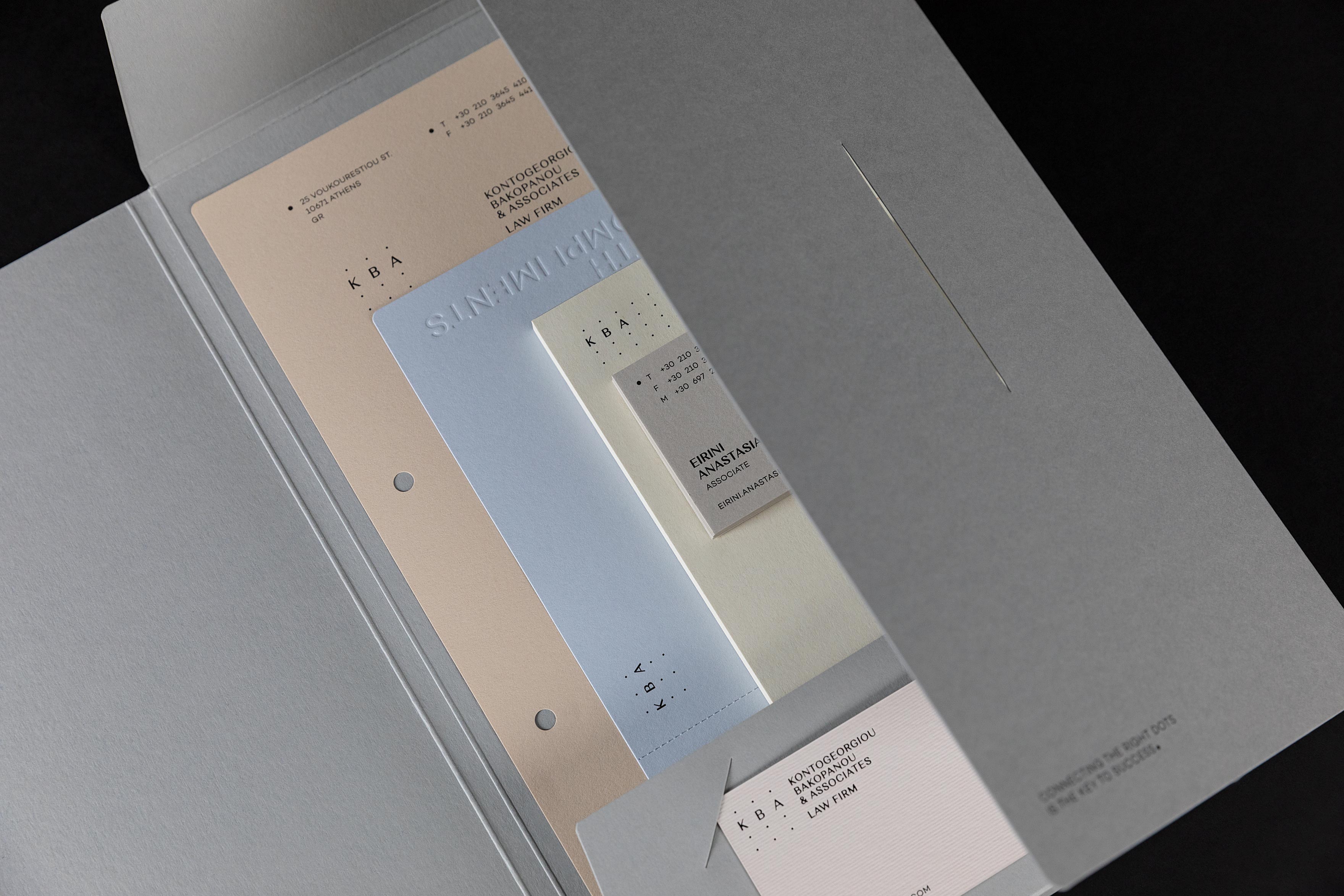
THE INITIALS OF THE LOGO BECOME PART OF THE PUZZLE
CREATED BY THE USE OF DOTS, WHICH ARE SPREAD THROUGHOUT THE IDENTITY’S APPLICATIONS AND CREATE A GRID THAT REFERS TO MIND MAPPING

RELATED PROJECTS