-
ΥΠΗΡΕΣΙΕΣ:
- Σχεδιασμός εταιρικής ταυτότητας
- Κειμενογράφηση
- Εικονογράφηση
-
Η τέλεια ισορροπία μεταξύ δημιουργικότητας και αποτελέσματος.
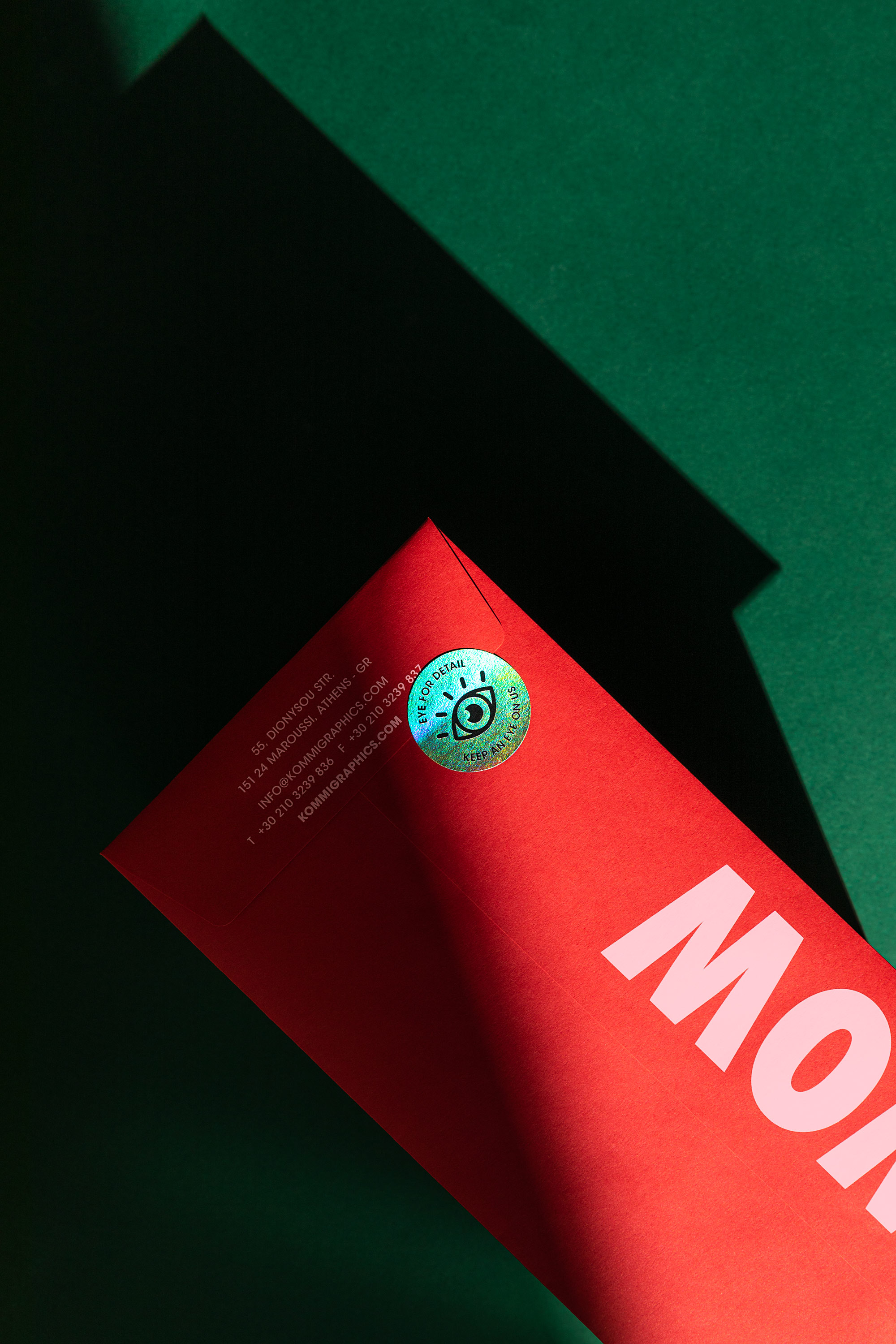
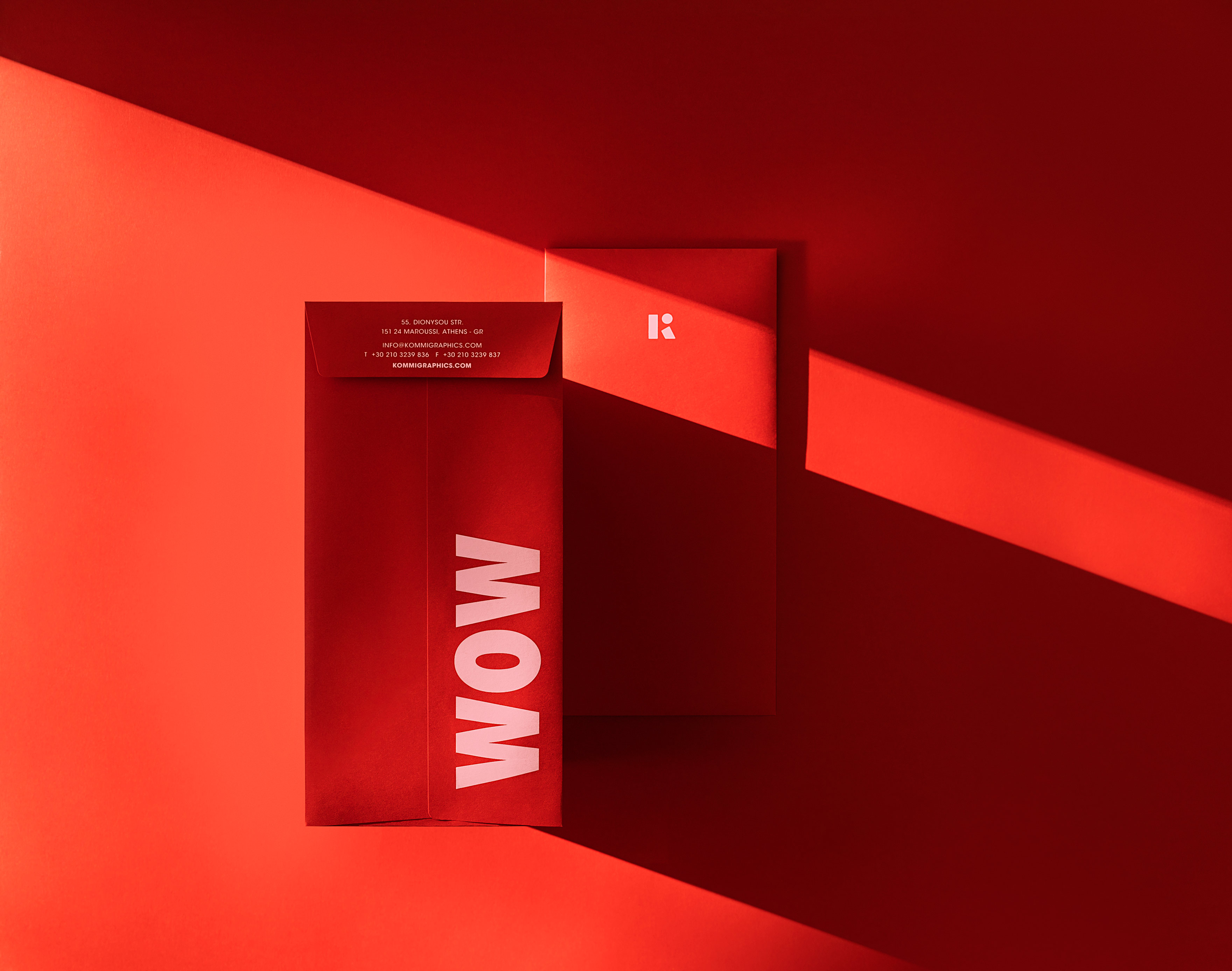
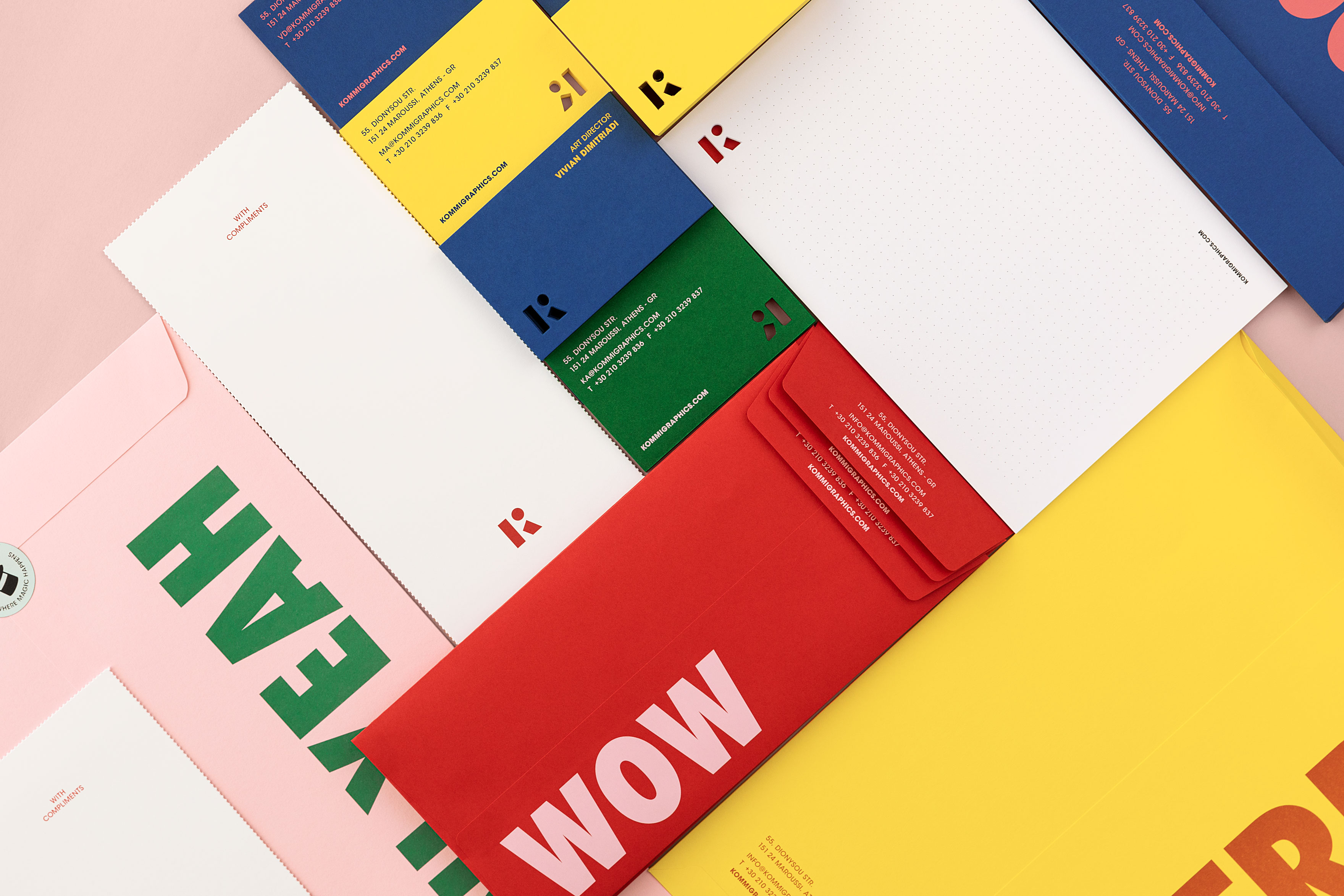
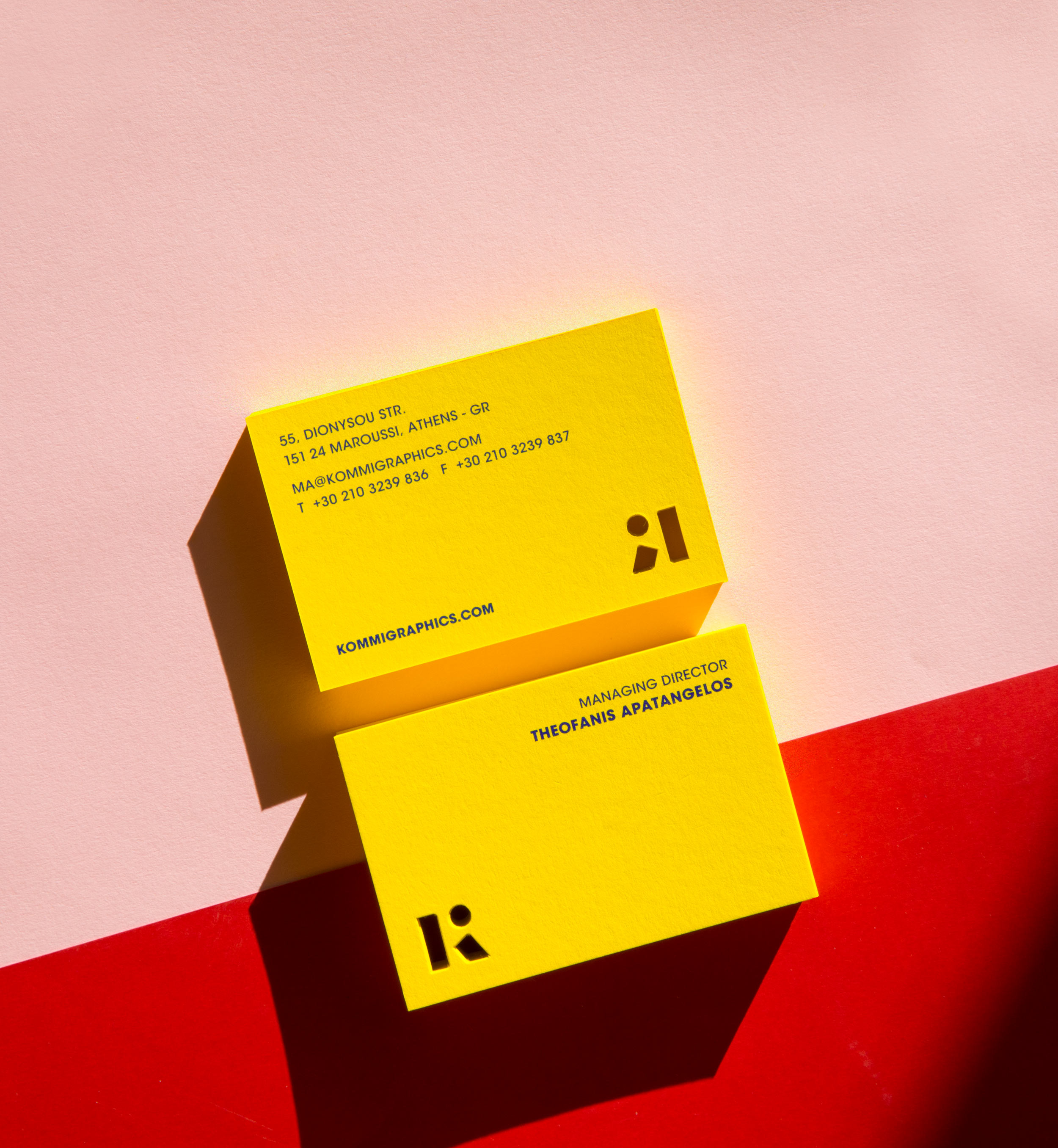
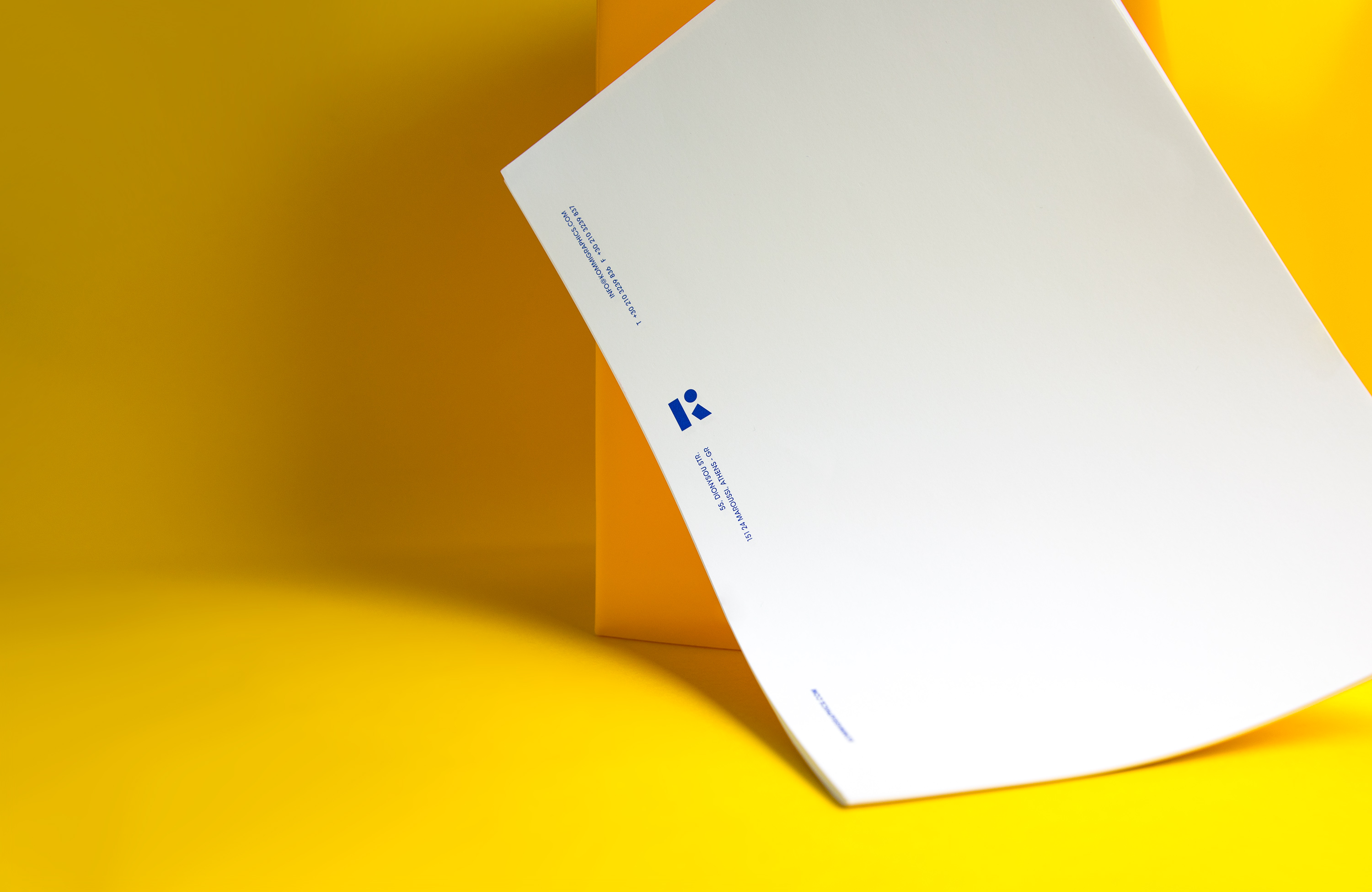
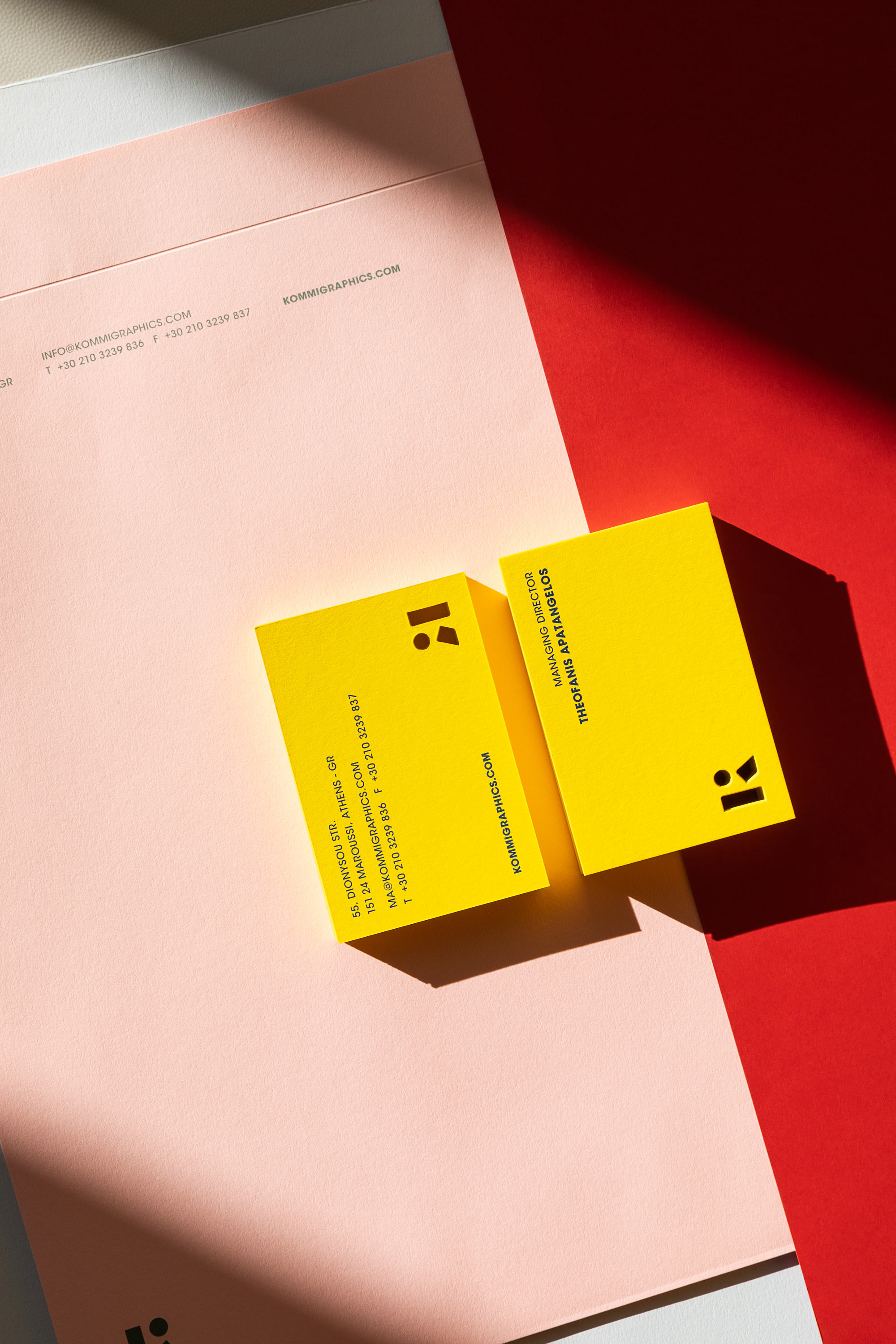
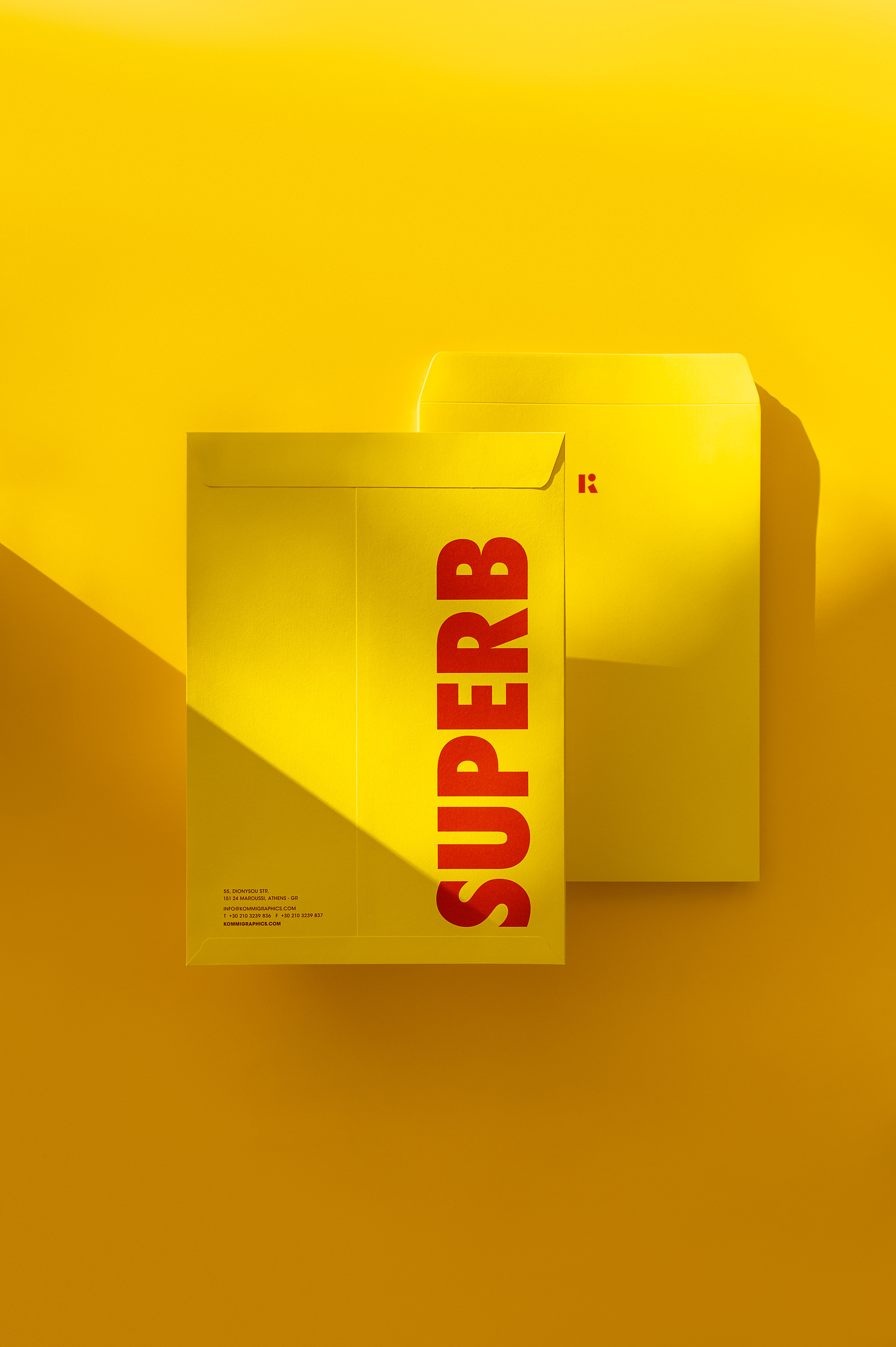
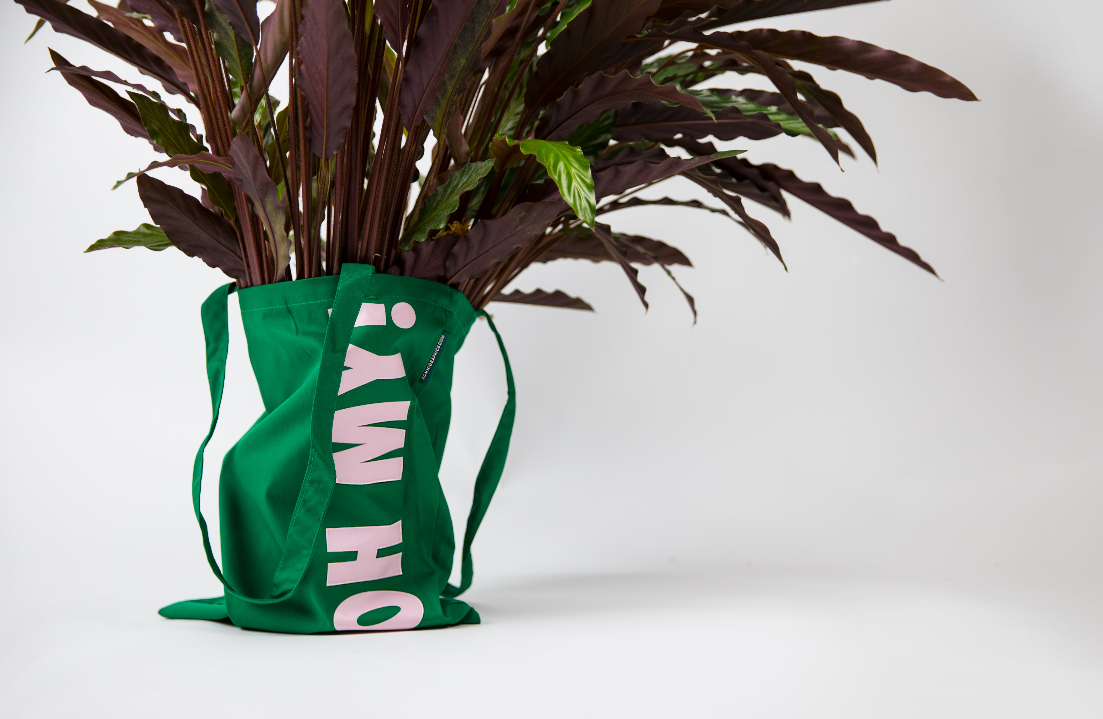
Η διαφορετικοτητα στα εργα που υλοποιουμε με γνωμονα την τελεια ισορροπια μεταξυ δημιουργικοτητας και αποτελεσματων, ωθησε στην επιλογη διαφορων χρωματων αλλα και διαφορων τεχνολογιων εκτυπωσης, τα οποια δενουν αρμονικα στο συνολο τους και ενδυναμωνουν την αρχικη ιδεα της διαφορετικοτητας και του πειραματισμου.
Η δημιουργική προσέγγιση κάθε έργου είναι ειλικρινής, σαφής, άμεση και μεθοδική, αναζητώντας ιδέες με απροσδόκητες αναγνώσεις, τόσο νοηματικά όσο και συναισθηματικά.
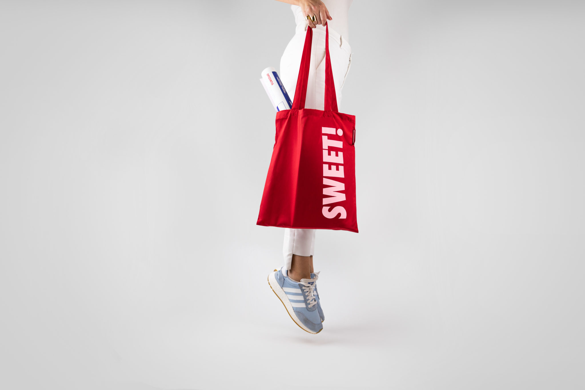
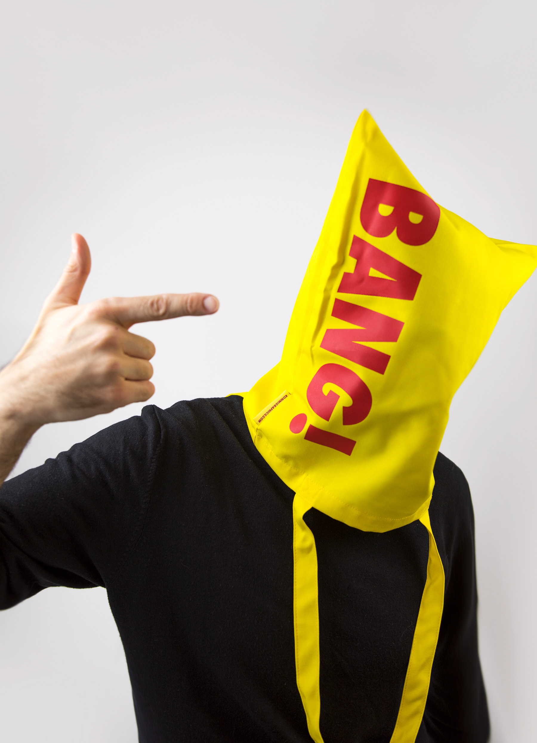
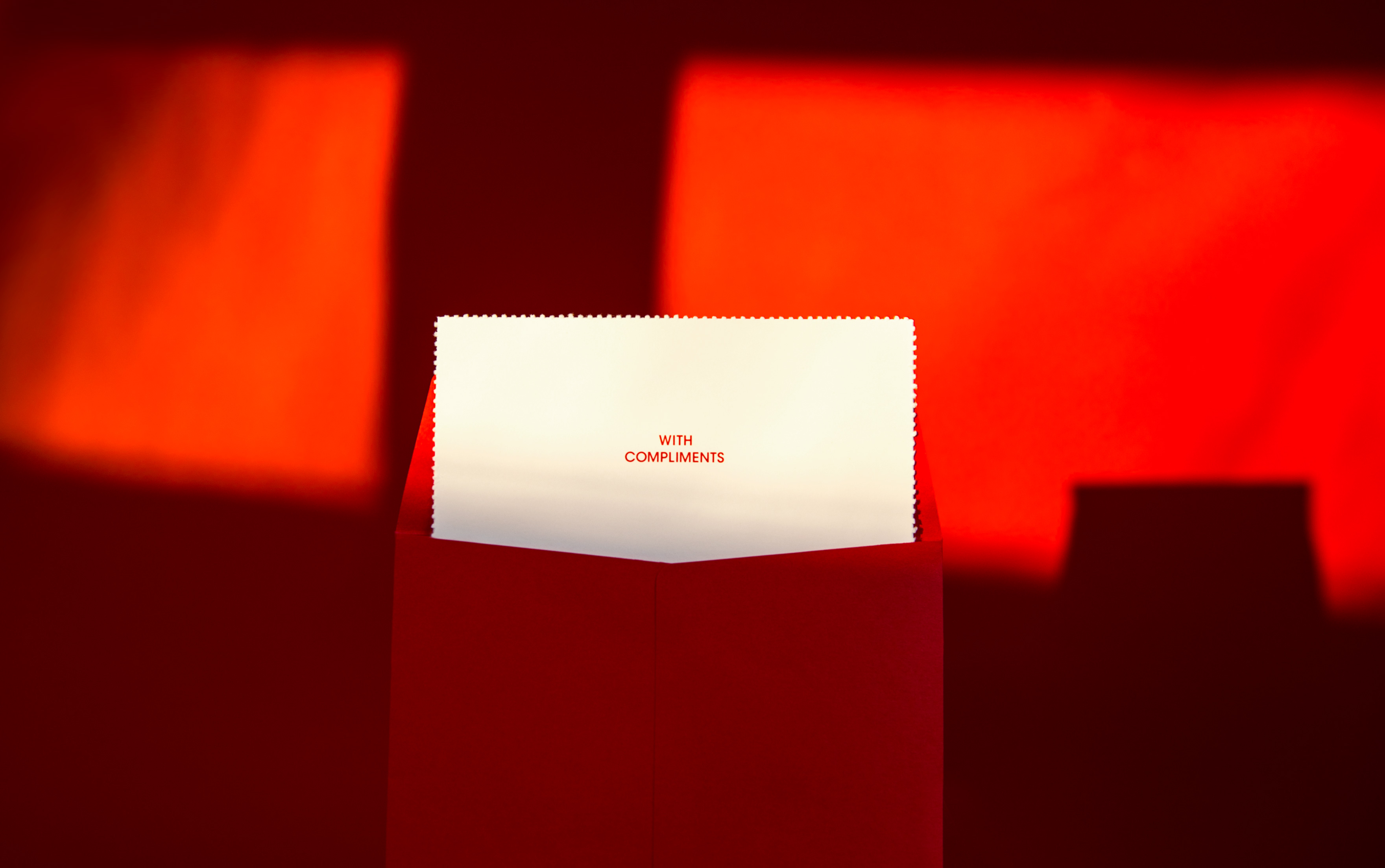
Aυτός ήταν και ο λόγος που επιλέχθηκαν εκφράσεις – επιφωνήματα χαράς και επιβράβευσης όπως αυτά που ακούμε από τους πελάτες μας ή αυτά που θέλουμε να ακούμε όταν παραδίδουμε ένα έργο.
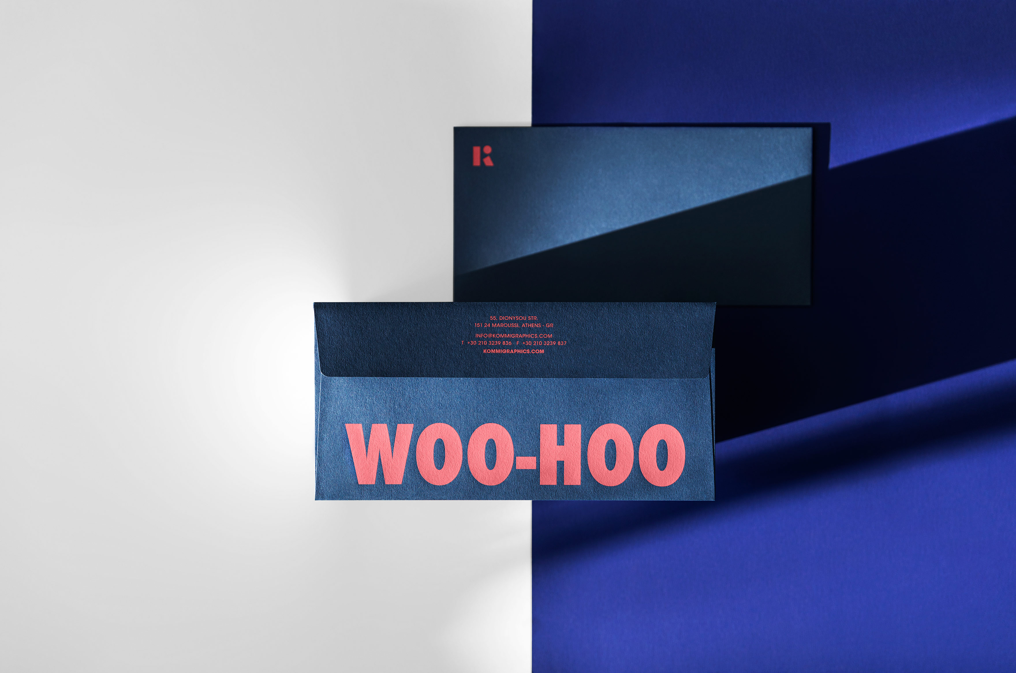
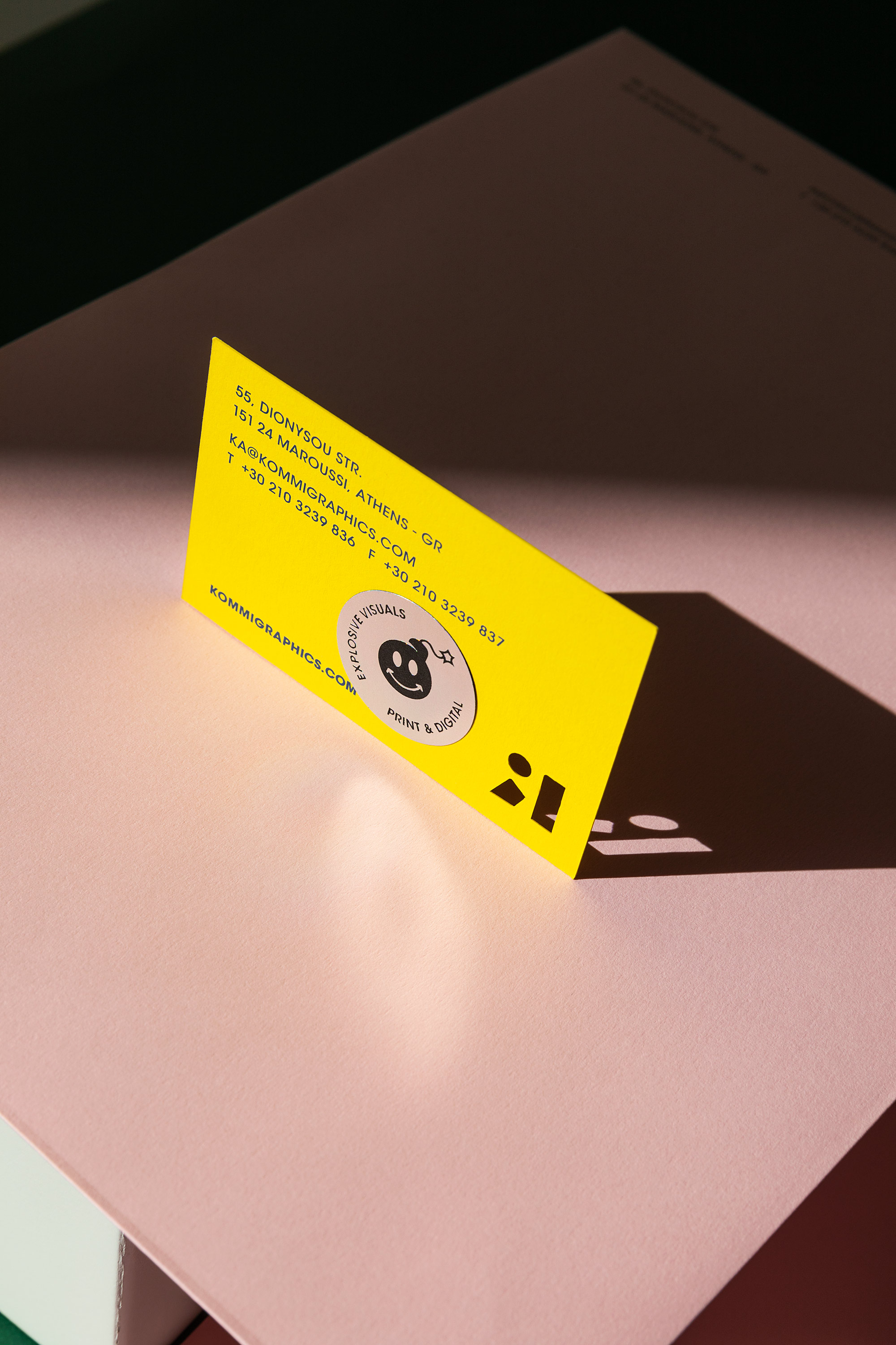
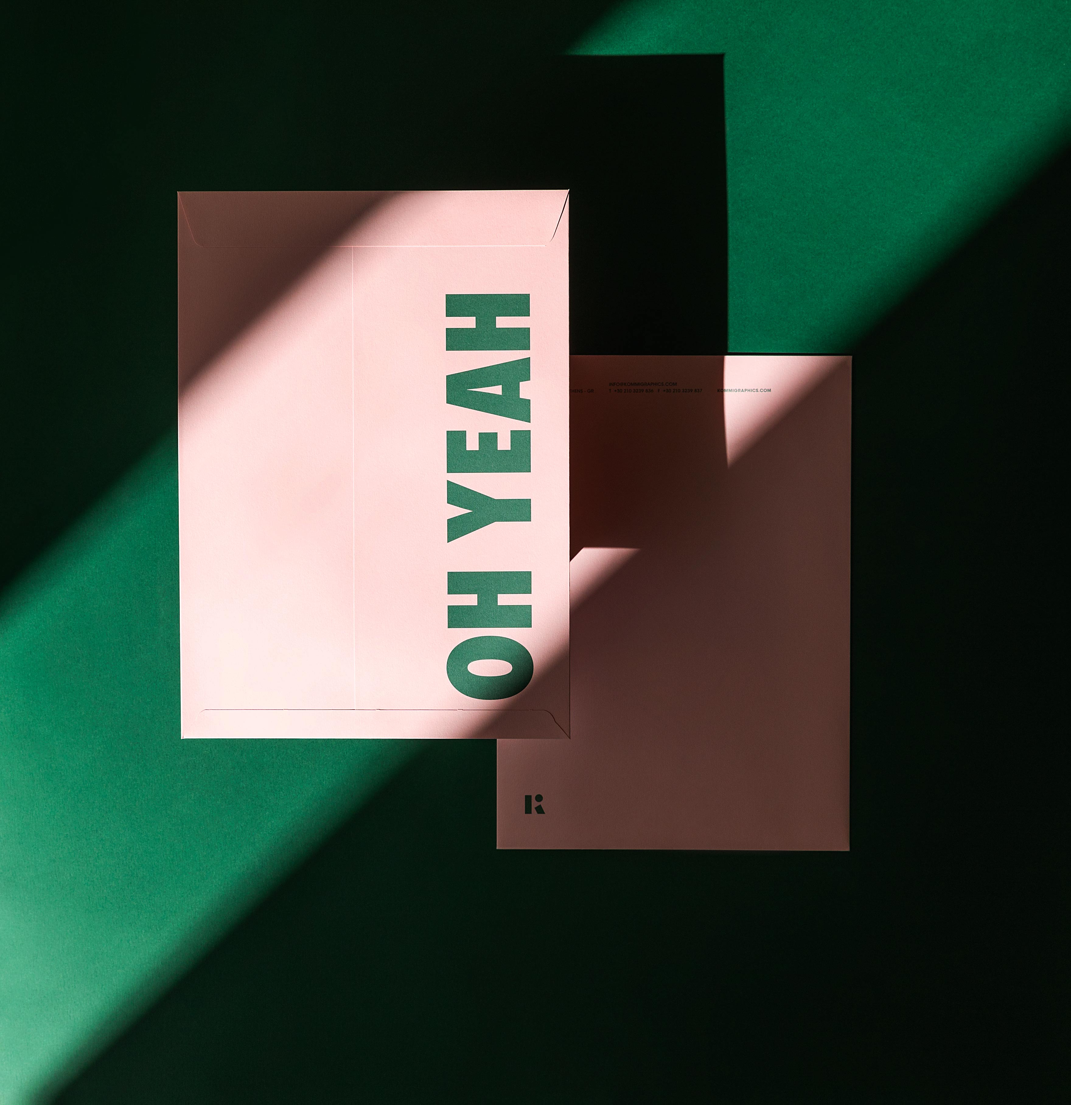
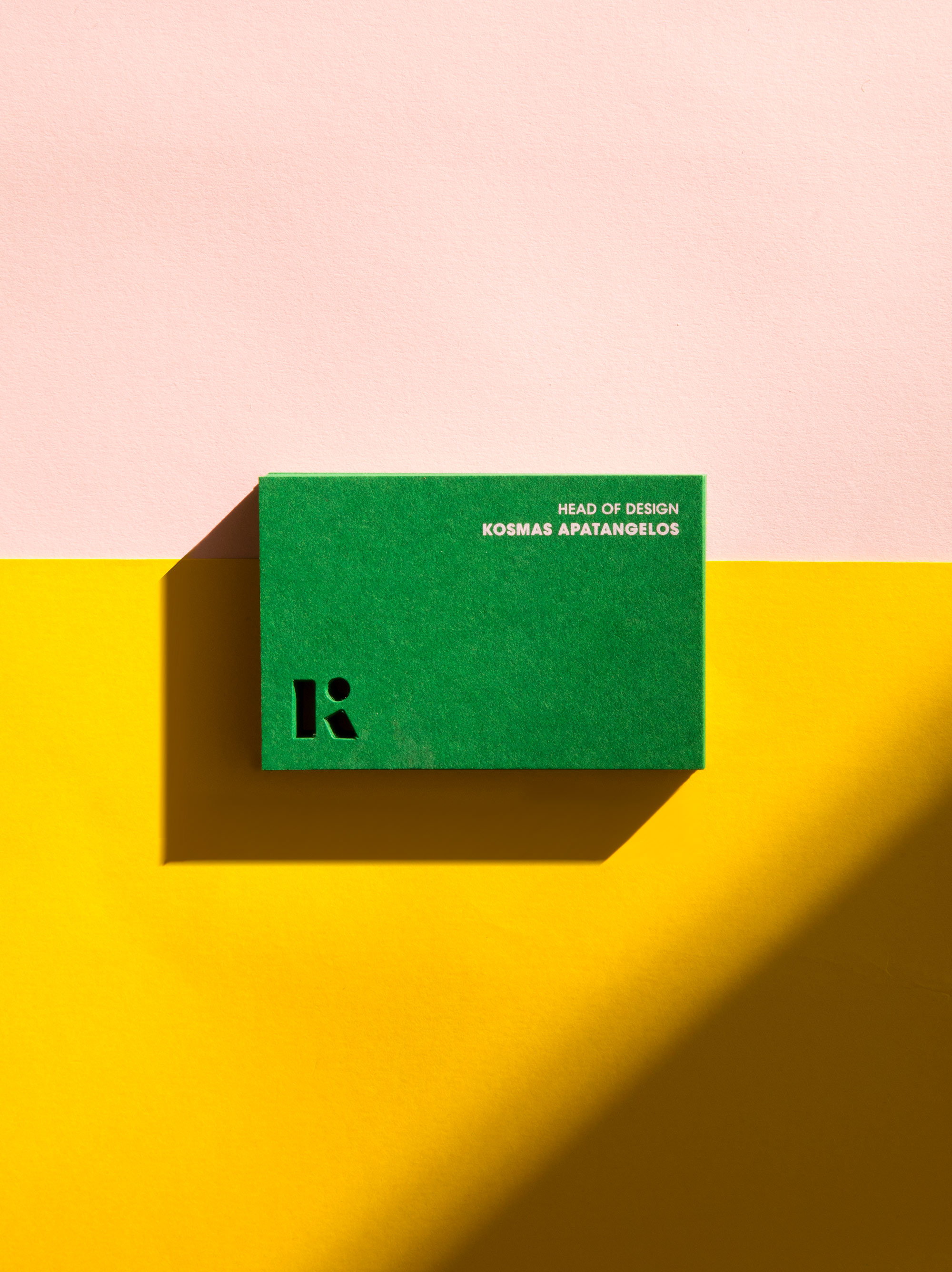
Η SANS SERIF ΤΥΠΟΓΡΑΦΙΑ ΚΑΙ ΤΑ ΔΙΑΦΟΡΕΤΙΚΑ ΣΤΗΣΙΜΑΤΑ
ΠΡΟΣΔΙΔΟΥΝ ΤΟ ΑΠΑΡΑΙΤΗΤΟ ΕΝΔΙΑΦΕΡΟΝ ΣΤΟ ΣΥΝΟΛΟ ΤΗΣ ΟΠΤΙΚΗΣ ΤΑΥΤΟΤΗΤΑΣ
Ο ΣΩΣΤΟΣ ΣΥΝΔΥΑΣΜΟΣ ΤΩΝ ΤΥΠΟΓΡΑΦΙΚΩΝ ΚΑΙ ΓΡΑΦΙΣΤΙΚΩΝ ΣΤΟΙΧΕΙΩΝ
ΕΚΦΡΑΖΕΙ ΑΠΟΛΥΤΑ ΤΟ ΥΦΟΣ, ΤΗ ΦΙΛΟΣΟΦΙΑ ΚΑΙ ΤΙΣ ΑΞΙΕΣ ΤΗΣ ΕΤΑΙΡΕΙΑΣ ΚΑΙ ΑΦΕΤΕΡΟΥ ΠΡΟΣΕΛΚΥΕΙ ΜΕ ΧΑΡΑ ΤΟ ΚΟΙΝΟ ΣΤΟ ΟΠΟΙΟ ΑΠΕΥΘΥΝΕΤΑΙ
ΣΧΕΤΙΚΑ ΕΡΓΑ